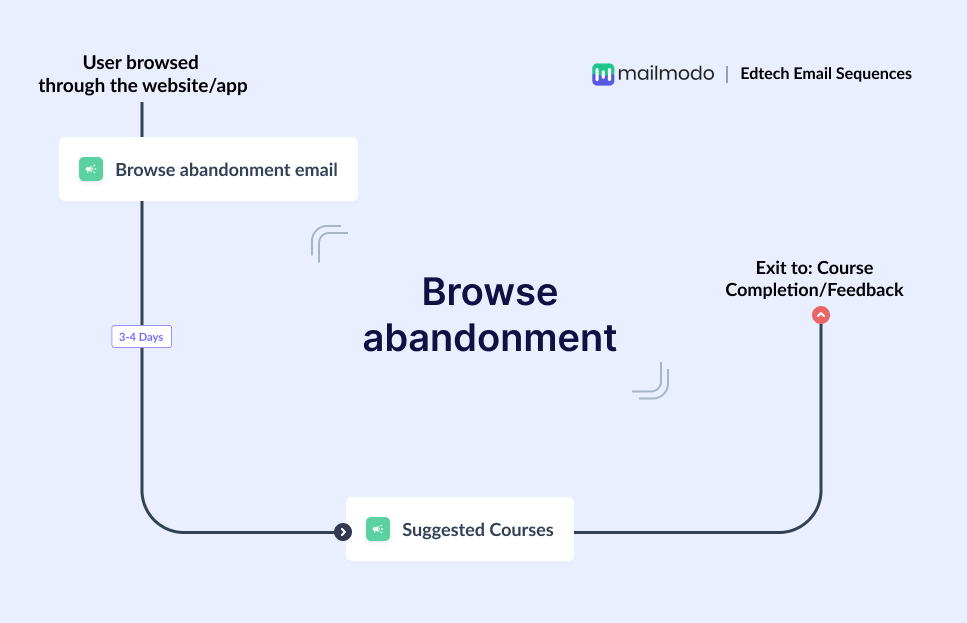
When a subscriber browses through your offerings but do not add anything in the cart and exits the app midway, we call it “browse abandonment.” You can leverage this touchpoint to remind subscribers of what they were looking through and show them how completing the transaction would be a good decision for them.
🎯 The goal of this sequence
- Show subscribers what they’re missing if they don’t sign p
- Provide them with more information about the course they were interested in
- Inform them about similar courses to help them make a better decision
Recommended flows - 2 emails
**Optimum flow time **- 1 week
Emails in this sequence
Email # 1 : Browse Abandonment Email
📩 Why this email
This is the first alert gently reminding the subscriber that they left without making a final decision. You can include a link to the course they were going through and a question asking them if they need expert consultation.
Email # 2: Suggested Courses
📩 Why this email
If the subscribers don't sign up, this email should go 3-4 days after the first email. You can include courses similar to what the subscribers were browsing through, social proof for them, and a link to expert consultation.
⛔ Sequence exit
Send them to feedback
Talk to an email expert. Need help? Schedule an email consultation. Don’t worry; it’s on the house.
