An abandoned cart is a recurring nightmare for e-commerce businesses - one of the biggest leaks in their sales and marketing funnel is shoppers who add products to their cart but then abandon them at checkout.
This is especially hard to swallow because businesses spend a lot of money to attract customers, gain their attention and bring them to their carts.
This article covers everything you need to know about abandoned cart emails, recovery strategies and creating your cart abandonment plan.
Table of contents
9 abandoned cart email examples we loved
- 1. Mailmodo: Shopping carts within emails
- 2. Codecademy: Two-series cart abandonment email
- 3. Warby Parker: Unconventional send timings
- 4. Whiskey loot: Showcasing value over the sale
- 5. 23andMe: Short yet impactful
- 6. Fantastic services: Touch of personalization
- 7. Ugmonk: Text emails work too
- 8. Thredup: It's a definite yes!
What is an abandoned cart email?
An abandoned cart email is a triggered email sent to re-engage customers who added items to the shopping cart but left without completing the purchase. These emails aim to remind customers about the items in their shopping cart and nudge them towards completing the transaction.
Abandoned cart emails work because the person intends to buy specific items by adding them to their cart. As the consumer is close to completing the purchase, these emails work perfectly to give that little push they need to buy.
But, if they were there to buy, why didn't they complete the purchase then and there only? Well, there are ample reasons behind such action. Let's discuss them first before moving forward.
Why do people abandon the shopping carts?
There are many reasons why users tend to abandon shopping carts, ranging from non-trusting the e-commerce provider to simply becoming distracted. It is important to know the way to close your sales. Here are some top reasons.
Baymard Institute, an independent web UX research institute, asked the U.S. audience about the reason for abandonment (other than the "I was just browsing" option). The top three reasons that came forward are:
High shipping cost - 48%
Need to create an account to complete the purchase - 24%
Delivery period too long - 22%
Here is the graph with a full analysis of the reason behind cart abandonment:
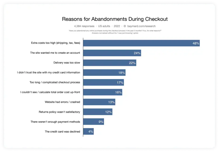
This analysis can help you in two ways:
- You can look at which of these issues might be causing cart abandonment on your site and work on resolving that issue. For instance, if most of your customers reported that the checkout process is too long, you can work on shortening it.
- You can create targeted emails that help resolve such issues. For instance, if your customers feel shipping costs are too high, you can nudge them with free shipping or a 10% discount on shipping if they complete the purchase immediately.
Why should you send abandoned cart emails?
The global average cart abandonment rate for eCommerce stands at 69.8%, meaning 3 out of 4 people come to your site, add items to their cart, and leave without taking action. That's a huge loss of revenue for an eCommerce brand.
So, abandonment cart emails are your chance to recover this revenue by re-engaging your customers.
All the reasons we mentioned above and other reasons such as calls from a friend, internet issues, or a delivery guy on the doorstep - all cause friction in the buying process, causing abandonment. Right cart abandonment emails at the right time can bridge the gap caused due to that friction.
This email works because the buying intent is higher, and abandonment emails give them a much-needed either by creating FOMO or simply asking them about the reason behind abandonment or creating urgency.
Here's what the Klaviyo eCommerce benchmark Q1 2022 report reveals about the effectiveness of shopping cart recovery emails:
The average industry open rate of cart abandonment stood at 50%, and the conversion rate was 3.72%. It leads to the generation of $3.42 revenue per recipient (RPR) - the highest among all email campaign flow.
You can see the full industry breakdown in the following table:
| - | Open rate | Click rate | Conversion rate | Revenue per recipient (RPR) |
|---|---|---|---|---|
| All industries | 50.00% | 7.29% | 3.72% | $3.42 |
| Apparel and accessories | 51.34% | 7.60% | 3.90% | $3.93 |
| Automotive | 48.96% | 7.85% | 3.51% | $9.52 |
| Electronics | 47.10% | 6.74% | 3.05% | $4.32 |
| Food and beverage | 50.00% | 7.34% | 4.03% | $2.60 |
| Home improvement | 50.10% | 8.16% | 3.60% | $8.49 |
| Health and beauty | 47.16% | 6.45% | 3.51% | $2.55 |
| Home furnishings | 50.89% | 7.85% | 3.73% | $5.54 |
| Jewelry | 50.00% | 7.76% | 3.64% | $3.41 |
| Mass merchant | 44.24% | 6.23% | 2.54% | $2.18 |
| Office supplies | 48.77% | 6.81% | 3.72% | $3.15 |
| Specialty | 47.82% | 7.03% | 3.57% | $3.11 |
| Sports and outdoors | 50.93% | 8.26% | 3.93% | $5.98 |
| Toys and hobbies | 49.07% | 7.41% | 3.78% | $3.01 |
How to create high converting cart abandonment emails
Let's get all your creative ingredients and make the high converting shopping cart abandonment email to recover those sales back:
1. Start with an attention-grabbing subject line
Begin with the subject line as beautifully designed emails would be futile if they don't open it. So, your subject line shout hit the point home.
Subject lines like your cart is waiting, you forgot something, or is your wi-fi working have been so overused that they have become generic and don't stand out in the inbox.
Instead, we recommend you put yourself in your customer; 's shoes and come up with ideas that resonate with them. Here are a few of our suggestions:
| - | Examples |
|---|---|
| Remind them: Yes, sometimes all they need is a gentle reminder. | |
| Create FOMO: People take action to avoid FOMO | |
| Help them decide: Ask if they have any questions or | |
| Complement them: Who doesn't like to feel good about their choice? | |
| Give them undeniable offers: Mention offers they can't resist |
2. Be straightforward in your email copy and design
An abandoned cart email aims to nudge recipients to complete their pending transactions. The headline comes first as users open your emails. So, it should hook the reader to keep reading.
Besides the headline, the text and the layout also matter. As these emails are not promotional but to nudge users to complete what they started, keep the email concise and consistent with your brand.
Keep your abandoned checkout emails straightforward. Your goal should be to make the checkout process as simple as possible, so no need for long emails here. -Brandon Matis, owner of Luxor Marketing
3. Use visually appealing images
Visuals are an integral part of engaging and appealing shopping cart recovery emails. For starters, there should be an image of product/products users left in their cart to let them remember what they left behind.
The images should be put in the most prominent position and must evoke some kind of emotional reaction as Yes! I want this.
Related guide: Email Design Guide to Create Highly Engaging Email Campaigns
4. Add social proof to reinforce trust
Sometimes users leave the cart because they don't trust the checkout process, product quality, etc.
Social proof goes a long way in helping customers determine whether they should go ahead with the checkout process. Testimonials related to the product they added, ratings and reviews, social media mentions, or any other user-generated content (UGC) can eliminate their skepticism and make them complete the purchase.
5. Don't undermine the power of discount codes.
Incentivizing your customers can help you get more sales as who doesn't like a discount?
Inform them about the product's price drop, associated promos, offers, etc. Incentives work; customers feel they get what they want, and that too at a bargain. That sense of instant gratification compels the action and boosts sales.
But, not every incentive will resonate with our audience. You need to consider whether to give a 10% off or free shipping.
Introduce a free shipping offer toward the end of your abandoned cart automation(s). Shipping cost is a very common reason customers leave before completing their purchase—a one-time free shipping offer is a great way to give them a nudge to place their first order. Keeping it at the end of your automation with engagement filters will help target engaged subscribers that are still on the fence about purchasing. - Belle Murray, eCommerce senior strategist at SmartBug Media
6. Get creative in your email CTA
By now, the recipient should be convinced that they should buy the product, and your email CTA will be the last nudge to propel them in that direction.
Be clear about what actions they should take even though they know you'll want them to purchase it to make CTA more specific & creative.
Instead of saying Buy now or Shop Now, try to sound more human-like, Grab your favorite items, Give me my 10% off, or Go show your cart some love.
When should you send cart recovery emails?
Timings play a huge role in cart recovery as an abandonment email after 2 days won't work as users might have bought the product from other brands or simply forgot about it.
Sometimes, a single email might not get you the result even though you send it at the perfect time. In such cases, you should create a cart abandonment sequence and set it up to send after the right interval to nudge recipients until they complete the purchase.
At Mailmodo, we offer automated drip sequences where you can define the number of emails to send that will get triggered based on the conditions you have set. Here's a hypothetical example of a multi-series cart recovery sequence:
Email 1: Reminder within a few hours of the customer abandoning the cart.
Email 2: Follow-up email sent between 24-48 hours of cart abandonment.
Email 3: Incentive-based email to lure the customer into making the purchase.
The benefit of setting automated series is it allows you to target the recipient at the right time based on pre-set triggers. Each email keeps reminding users about the purchase and increases their chances of conversion.
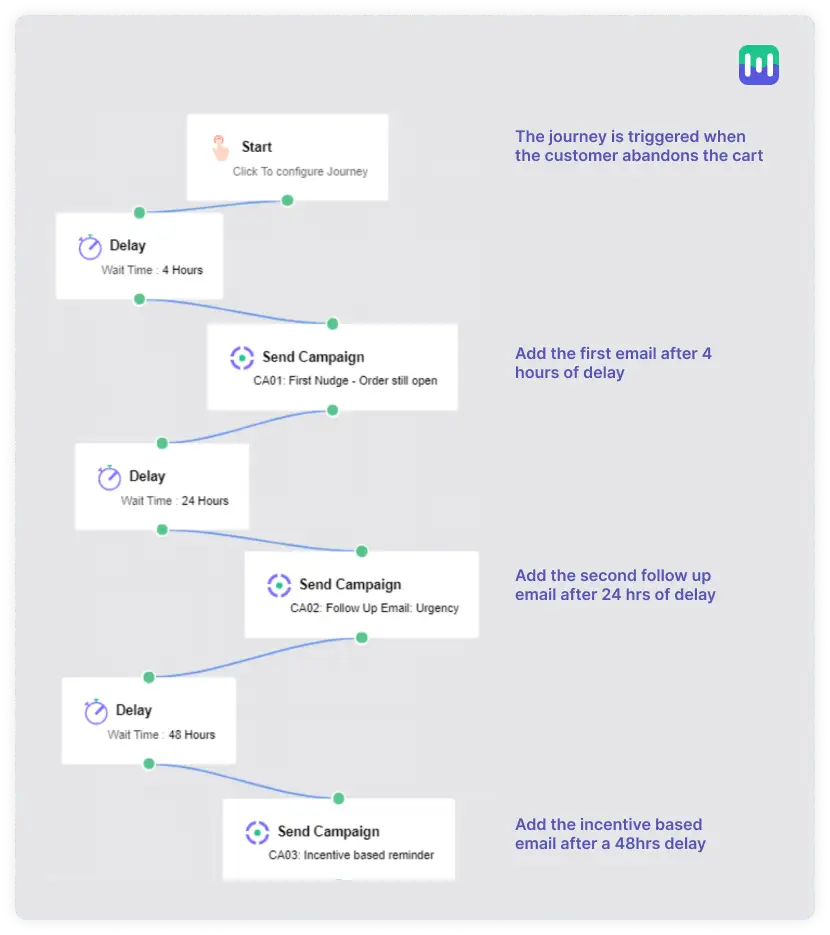
Check out our automation setup help guide to create your first drip sequence with Mailmodo.
9 abandoned cart email examples we loved
Steal our most loved 9 cart abandonment emails and get those visitors back:
1. Mailmodo: Shopping carts within emails
Mailmodo brings shopping carts within emails rather than making users go to a browser to complete the transaction using AMP for email.
This email works as it minimizes distractions, braces steps involved in the checkout, and makes the conversion process much smoother.
Besides interactivity, the 20% discount code gives that extra push to the recipient. Not only that, the inclusion of social proof leaves no stone unturned, making it a perfect cart recovery email.
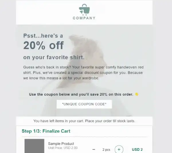
Check out more such abandoned cart email templates.
If you use Shopify, you can add a cart in email with Mailmodo's seamless integration with Shopify. Check out this short video to know how to integrate:
Learn more about Shopify and Mailmodo integration
2. Codecademy: Two-series cart abandonment email
Codecademy nudges its customers with 2-series abandonment emails to finish purchasing the pro membership.
1st emails - Sent after 2 days of abandonment
Subject line: Don't forget your Pro membership
The subject line is a great reminder to complete the pro membership purchase. The email design is simple, and headlines further compel them to start their pro membership.
The copy is concise and removes the objection by clarifying that there is only one setup users need to take to enjoy the many benefits Codecademy has to offer.
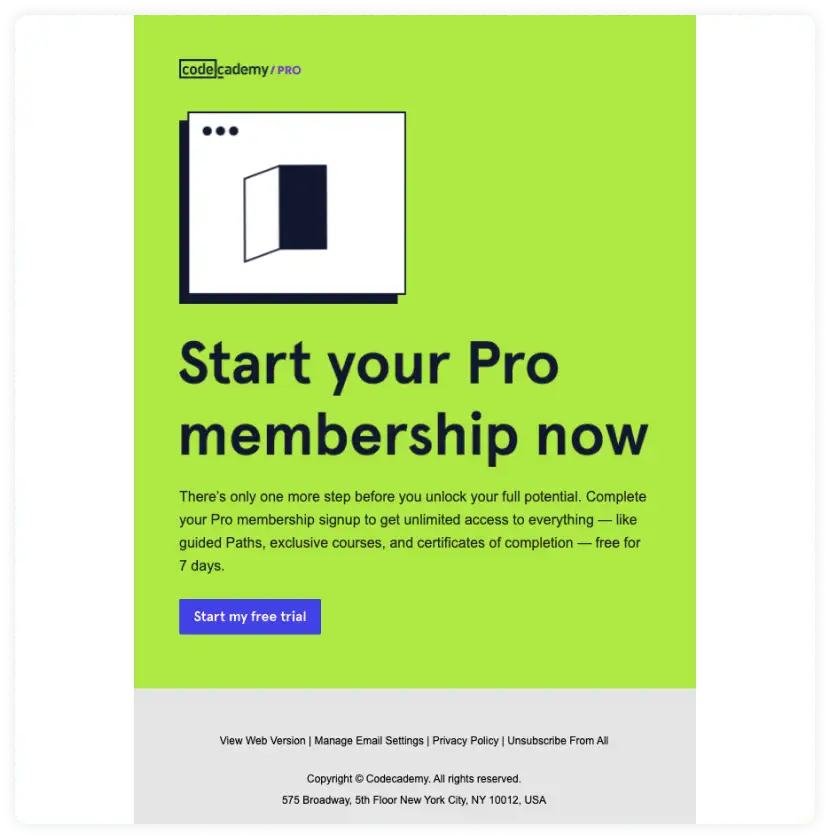
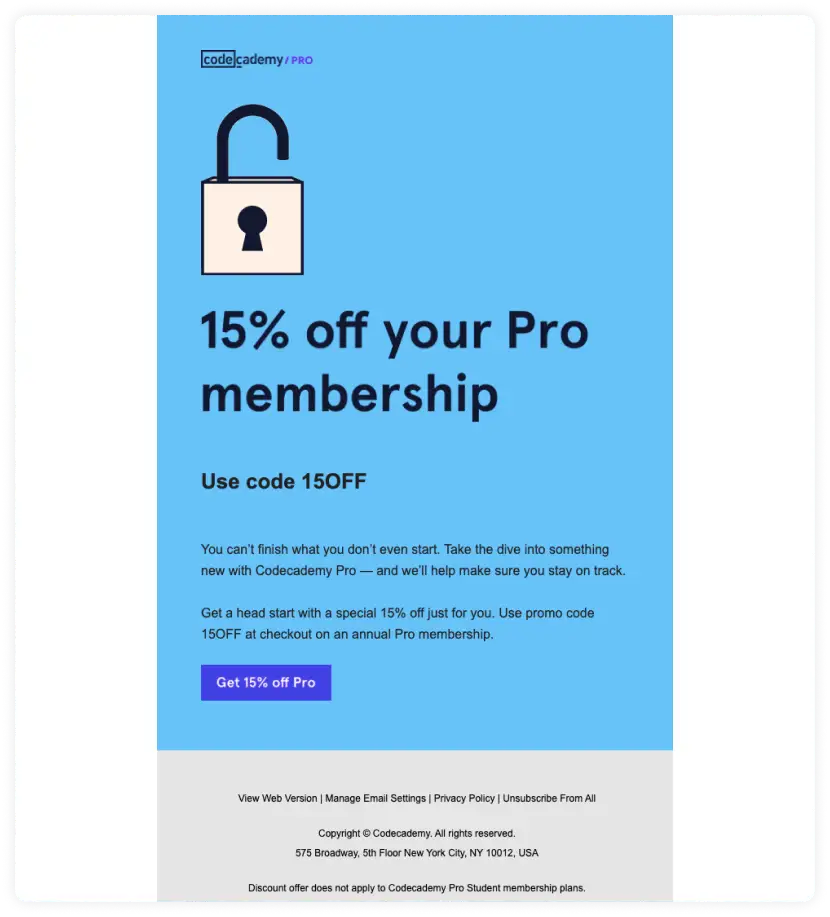
2nd email: Sent 2 days after the first email
Subject line: Dive in deep for less
The subject line points towards a possible discount in the email, making users open it and see that they are offering 15% OFF. That can entice customers willing to buy but couldn't due to high prices or budgetary constraints.
They have maintained the brand consistently by using the same structure as their first email, which helps recipients recognize the email.
But, the background and CTA colors offset the design as both seem to conflict.
3. Warby Parker: Unconventional send timings
Most brands will advise against what Warby Parker does (sending a single email after abandonment), but they have tested this approach, and it works for them.
Here's what we think behind such unconventional reasoning:
- A single email to not annoy the subscribers.
- Sending 4 days after the abandonment gives adequate time to consider their decision.
We won't advise copycatting their approach as Warby Parker is a big brand, and they tested this method. So, you should test out what works for your audience and go with it.
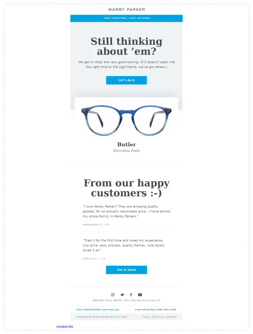
Now, let's break down what makes this email a good abandoned cart example:
- An enticing offer right at the top: Free shipping and free returns (perfect for 48% of users who abandoned due to high shipping)
- The subheading first compliments the recipient's choice and then puts forward the available choice at their store in case they no longer want this pair.
- Next comes the image of the product as a reminder
- Finally, the last card in the game - testimonials supporting Warby Parker.
4. Whiskey loot: Showcasing value over the sale
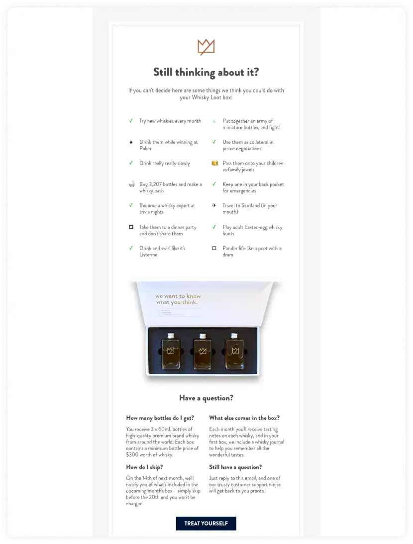
Subject line: Your cart is sobering up
The email design looks clean and gives minimal outlook, but at first, glance seems too text-heavy for an abandonment email. But, that's what makes stand out as it breaks the typical abandoned email barriers.
The text displays the value of their product and is easy to digest points with relevant emojis. Then comes the image of the product.
In the end, they are reducing friction in the decision process by mentioning FAQs and answering them. The emails end with a creative CTA that gives a feeling of instant gratification.
5. 23andMe: Short yet impactful
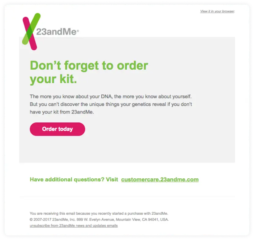
Subject line: Your DNA kit is waiting for you
Even without having an image, this email by 23andMe makes a good abandonment email as it accomplishes three things:
- It's short, so the user's attention is not divided so the recipient can take the decision easily.
- The email copy highlights the value of having the kit from 23andMe.
- The email coloring and design are consistent with the brand.
6. Fantastic services: Touch of personalization
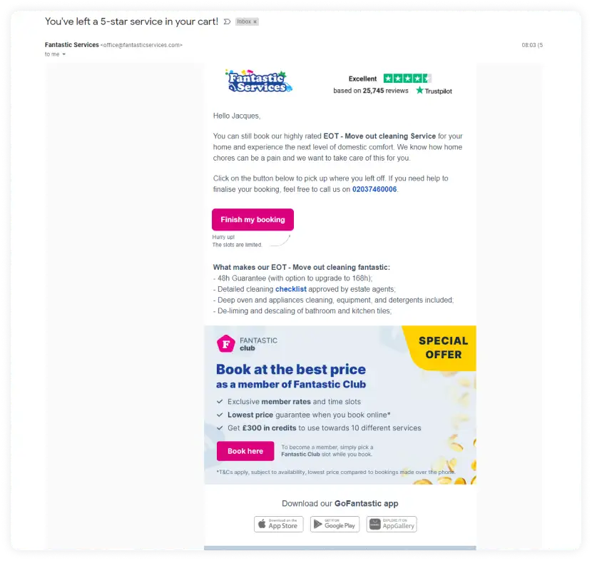
Subject line: You've left a 5-star service in your car!
This email made the best cart abandonment email because of its intriguing subject line that enforces the credibility of its services. Besides, the reviews are placed at the top to grab instant attention.
Fantasic services adds a touch of personalization by greeting users with their first names. Not only this, they target the recipient's pain point (home chores can be painful) and let them know they can help resolve that.
After the CTA, which is made distinct using a contrasting color, they also offer the reasons for choosing their services.
7. Ugmonk: Text emails work too
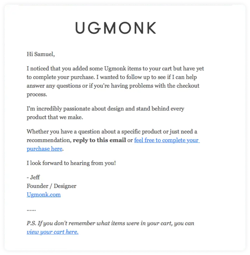
Ugmonk sends this text only by cart recovery email, and it works because the copy is personalized, and it seems like someone took the time and effort to write this, especially for the reader. It evokes that instant connection making it a different yet successful cart abandonment email.
The P.S. text also reduces the friction as sometimes the recipient might forget what they added to the cart. So, adding a link to view the cart is helpful.
8. Thredup: It's a definite yes!
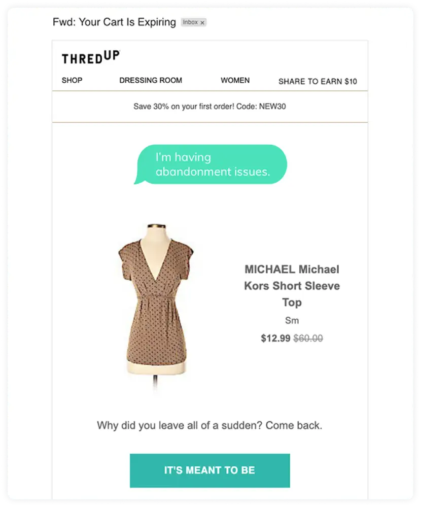
Subject line: Your cart is expiring
Everything about this email by Thredup made us laugh, from the headline to the wordplay in the CTA, 'It's meant to be.' And let's not forget about the product image playing a major role in this email.
And even if the recipient doesn't find it funny and playful, they had to cover all the bases by adding a 30% off to entice them to click the CTA button and accept their proposal.
Abandoned cart email best practices
To get the most out of your cart recovery email, follow these best practices:
• Use personalization
Be specific in addressing your customers by personalizing your abandoned cart email. Personalization includes speaking to them directly using their name and referring to items the specific customer left behind. Your emails should also have session regeneration links so your customer can easily return to their specific items.
• Create an exclusive offer for first-time buyers
People like it when you exclusively treat them, and when someone buys from you for the first time, exclusivity can set you apart and make those customers feel special. Make sure to mention that you are offering them an exclusive offer as they are new to your brand and want them to buy again.
• Add similar or recommended products.
Sometimes customers might abandon carts because they didn't find what they were looking for. In such cases, showing the same product in the cart might not entice them to take action.
The solution?
Recommend them products that are similar to what they added to their cart. It will give them options to choose from, and they might get something they like more than the items in their cart.
• Run A/B tests
Sometimes even after all the optimization, you might not see the results. In such a scenario, it's best to test your emails rather than relying on your guesswork.
A/B testing helps you get data-driven insights that resonate most with your customers. These insights can help you improve your cart abandonment emails campaigns by identifying which elements resonate most with the customers.
Way forward
Cart abandonment emails are one of the best emails you can leverage to generate higher revenue, and when you combine it with SMS marketing, it can get you significant returns.
Why? Primarily because SMS is even more accessible than emails, and you can reach out to customers even when they're offline. Check out our guide on SMS marketing and see how you can leverage it to boost sales by re-engaging your customers.


