Imagine paying a lot of money to drive traffic to your business online, only to find that it doesn't convert. Your company's growth is on a downward slope. No leads, no paying customers, no revenue. Your first instinct may be to raise your marketing spend. But what if we told you that you can convince people to buy from you without having deep pockets?
You heard that right! You can make your user's buying journey easier, shorter, and smoother by improving their experience. This process is called Conversion Rate Optimization or CRO. Packed with advice from Conversion Optimization experts, read our guide to understand the basics of CRO. Ready to increase your conversions like a pro? Let's go!
Table of contents
When does conversion rate optimization give diminishing returns?
Where to apply conversion rate optimization on your website?
15 conversion rate optimization strategies and best practices
- 1. Offer free trials of your product
- 2. Make your call to action button prominent
- 3. Experiment with color combos
- 4. Display your service cost on the landing page
- 5. Test the placement of your social media buttons
- 6. Write concise product descriptions
- 7. Make your CTA copy click-worthy
- 8. Create a relatable demo to increase conversion rate optimization
- 9. Use persuasion principles to boost conversion rate optimization
- 10. Expand your product image
- 11. Feature a trust badge on your landing page
- 12. Add a message to your landing page on important festivals
- 13. Add customer testimonials or pictures to your product page
- 14. Have clear communication on your landing page
- 15. Use a grid layout for your online shopping page
What is a conversion rate?
For context, conversion rate is the percentage of potential customers that convert. If you’re running a business, a high ecommerce conversion rate means you're able to convince your audience to trust you. A low rate of ecommerce conversion means your value isn't conveyed well. This could be due to page load time of your ecommerce sites, poor design, or copy.
You can calculate conversion rate by dividing the number of conversions by the total number of visitors and multiplying it by 100.

For example, your email campaign has 20,000 visitors. 500 register for it. Your conversion rate is 500 divided by 20,000 ( 0.025) and multiplied by 100 = 2.5%. If 900 visitors convert, your conversion rate will jump to 4.5%.
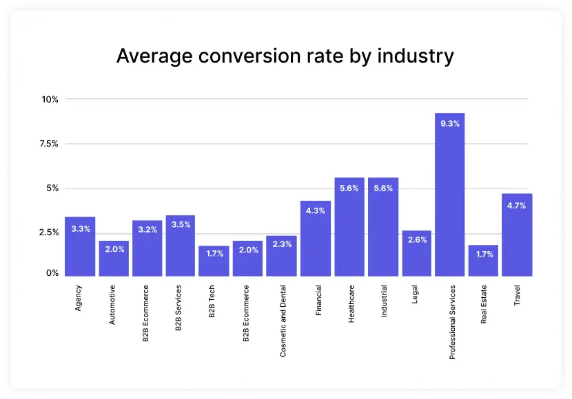
Some marketers suggest that 2% is a good rate of conversion. But our expertise says that you shouldn't rely on a figure. Your conversion rate depends on your conversion goal, which is personal to you. Your marketing strategy, niche, and time spent in the industry can also affect it. Bottom line: don't compare yourself against others. It is clichè, but it is true! You're better off focusing on connecting with your audience. Website conversions will follow once you understand what they want.
What is conversion rate optimization?
Conversion rate optimization in digital marketing is the process of increasing the share of website visitors to your page who take the action you want them to.
Micro conversions are small engagements you seek from consumers, like:
Comment on an article
Download an ebook
These lead your users to macro conversions or the primary goal of a business, like:
Free trial
Request a quote
Make a sale or a booking
Sign up for a premium subscription
Because an action didn’t make you any sales doesn't mean it’s less beneficial. World leader Nielsen Norman Group explains:
Process Milestones are conversions that represent linear movement toward a primary macro conversion. Monitoring these will help you define the steps where UX improvements are most needed.
It’s quite like running an online store. People come and browse, but some leave without spending any money. How do you get them to meet your goals? That’s where conversion rate optimization experts come in to help.
Related guide: A Complete Guide to Identify and Optimize Micro Conversions
Benefits of conversion rate optimization
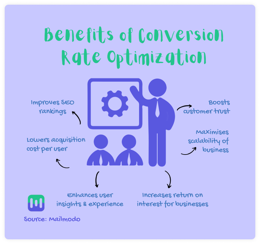
Here's the truth. Your business will not reach its fullest potential until you experiment with conversion optimization strategy. And if you do, you will reap these exciting rewards:
Steps of conversion rate optimization
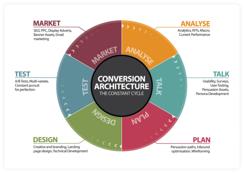
For an effective CRO strategy, define your conversion goal. Your goal may be to get users to register for a webinar. Or to get customers to fill up a form.
Once you've defined it, analyze your website and look at elements of conversion you want to include in it. You may want to connect and talk to your users to assess their experience. Plan the path of persuasion to convince them to click. Designing elements like widgets and surveys can make that possible.
Create your hypothesis to run a test. You can use this framework:
By [adding this], the conversion rate will rise because it [fixes this problem].
For example: By adding customer testimonials, the conversion rate will rise because it will give credibility to our website.
- Finally, decide how to integrate your internet marketing strategy into CRO to showcase better results.
Conversion rate optimization tools for your website
There are many tools you can use to automate optimizing conversion rate for your website:
| Tools | Application/Function |
|---|---|
| Qualitative data tools (numerical data) | |
| Form analysis tools | Track submissions |
| Customer Satisfaction or CSAT measuring tools | Measure user behavior, specifical satisfaction on a scale of 1 to 10 |
| Traffic analysis tools | Track your website visitors, like Google Analytics |
| Website heat map tools | Track scrolls and clicks using cold and hot colors |
| Quantitative data tools (non-numerical data) | |
| Website feedback tools | Assess user experience |
| Website session replay or recording tools | Record the user behavior while they are browsing |
| Online review tools | Give more information about your products or services |
| Usability testing tools | Allow customers to voice their thoughts on your site |
| Testing tools (report on CRO goals) | |
| A/B testing tools | Test variations of your web pages to find the best-performing one |
| Conversions tracking tools | Report on CRO goals, like Google Analytics |
Also read: How To Use Heatmaps to Analyze Your Website Performance
When does conversion rate optimization give diminishing returns?
Your CRO efforts will give low returns if:
You make changes based on a hunch rather than data.
Your copy's voice doesn't align with your business goals.
Your conversion funnel is complex.
You run too many pop-ups and tests.
You completely ignore the design elements, like CTA buttons.
You don't give enough credit to video content.
Your CTA copy is ineffective. (Pro tip: Instead of saying Sign Up or Submit, how about Where Should We Send Your Free Copy?)
Your CTA button is not prominent.
You don't create a sense of urgency through your website copy.
Your website is too slow to load.
Where to apply conversion rate optimization on your website?
Here are 5 areas of the website which you can optimize to boost your conversion rate:
1. Homepage
We suggest linking the product information on the homepage, besides adding a chatbot and free signup button.
2. Landing page
Offer a free resource but only give a preview of it on your landing page to develop curiosity in your visitors’ minds. You can also experiment with the color scheme, headlines, and copy.
3. High-intent page
Rely on customer ratings, reviews, testimonials, case studies, tweets, and press releases to spell out your USP on the high-intent page. It could be a product page, registration or booking page.
4. Blog
Add a CTA in the blog and ask visitors for their email address in exchange for a free industry report or an ebook.
5. Advertisement
Ensure the ads are mobile-friendly and test them to run a successful campaign.
Related guide: How to Create Successful Display Ads
In the next section, we will discuss strategies you can use to optimize these pages for higher conversions.
15 conversion rate optimization strategies and best practices
There’s no stopping you if you implement conversion rate practices given in these case studies:
1. Offer free trials of your product
Case in point: Mailmodo
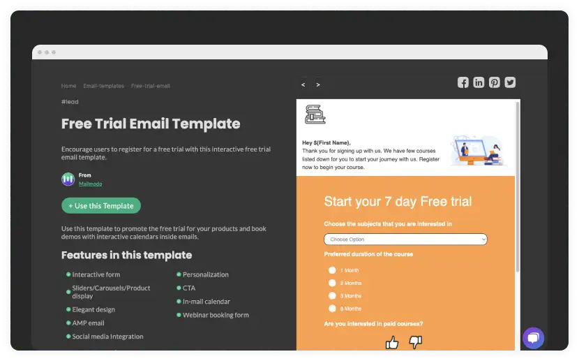
Result: By encouraging users to register for a free trial with interactive free trial email templates, we achieved more conversions than before.
2. Make your call to action button prominent
Case in point: Nature Air
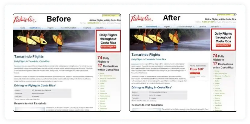
Result: Nature Air did A/B testing on their landing pages by making the size of the CTA button more prominent. Their conversions improved by 591%, proving you should make your CTA easy to find.
Related guide: How to Use A/B Testing to Improve Conversions
3. Experiment with color combos
Case in point: Performable
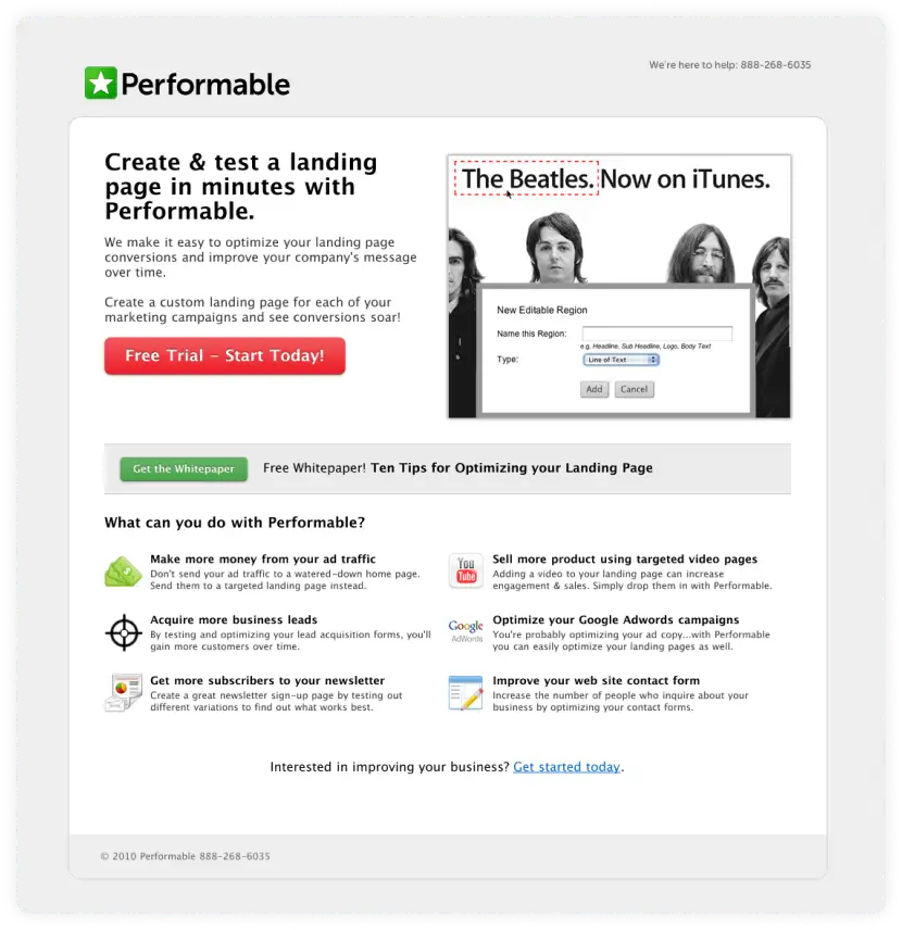
Result: Performable used an A/B test with a green and red CTA button on their homepage. 21% more users clicked on the red button because red stands out according to color psychology.
4. Display your service cost on the landing page
Case in point: Safesoft Solutions
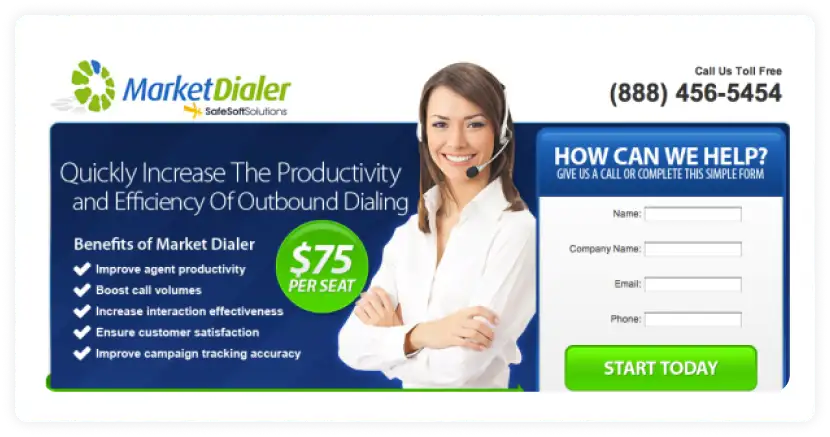
Result: By displaying their price on the landing page, they generated 100% more leads and had a positive impact. This strategy removed one step from the conversion funnel – talking to the salesman about the costing.
5. Test the placement of your social media buttons
Case in point: AMD
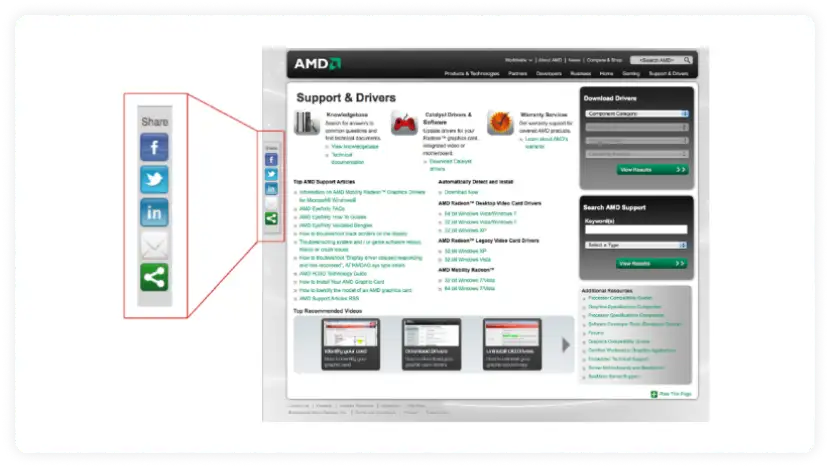
Result: AMD saw a growth in their conversions by placing the social media buttons on the left-hand side. You should use an A/B test to see what works for you.
6. Write concise product descriptions
Case in point: Unionen
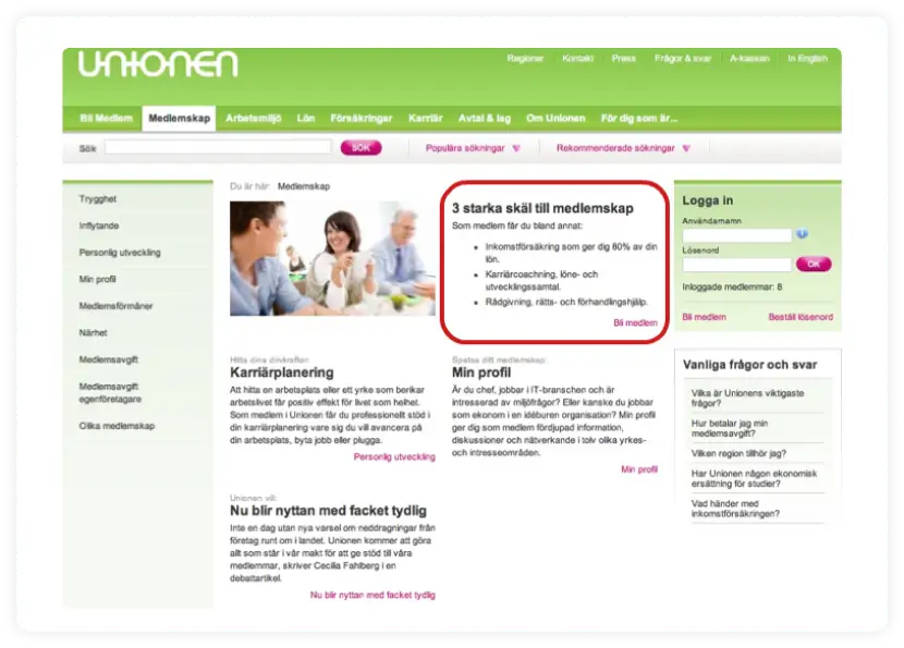
Result: By using bullet points, Unionen increased the membership signups by 16%. While writing descriptions of products or highlighting their benefits, write in conversational and easygoing language.
7. Make your CTA copy click-worthy
Case in point: Sprockets R us
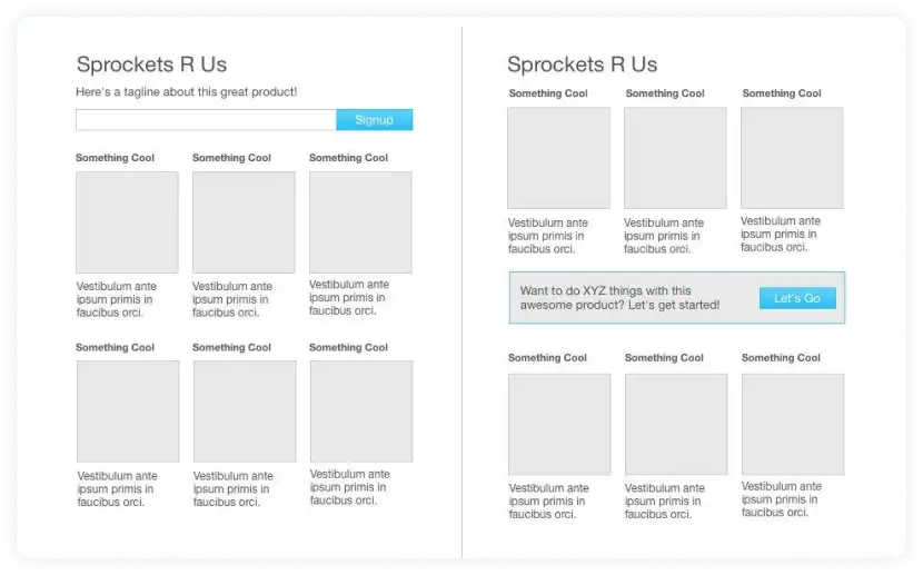
Result: Sprockets R Us increased signups by 350% after creating a call-to-action bound to turn heads.
8. Create a relatable demo to increase conversion rate optimization
Case in point: Performable

Result: Performable used split testing increased their conversions by 112.5% by creating an eye-catching and personalized demo.
9. Use persuasion principles to boost conversion rate optimization
Case in point: Betfair
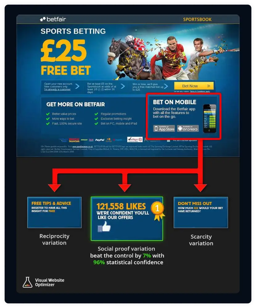
Result: Betfair used scarcity, reciprocity, and social proof to boost their conversion rates by 7%. You can also consider incorporating persuasion principles into your marketing strategy.
10. Expand your product image
Case in point: Skinner
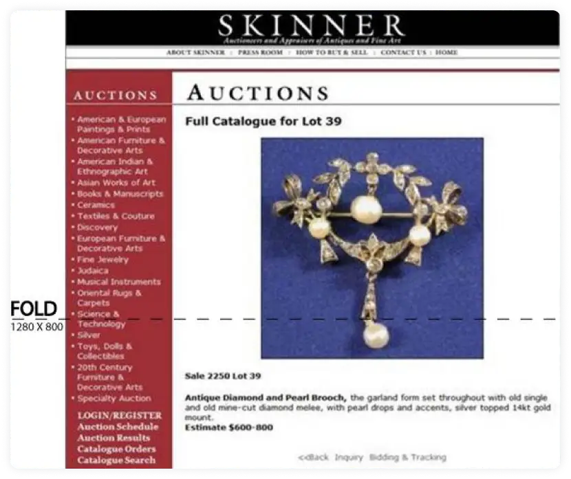
Result: Skinner converted 63% more users by increasing the size of the product image. The enlarged image will help your viewers see your product in close up.
11. Feature a trust badge on your landing page
Case in point: Bag Servant
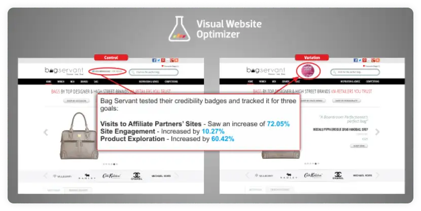
Result: Using a badge boosted the credibility of Bag Servant, who got 60.42% more conversions. This is a clever strategy for small and medium businesses.
12. Add a message to your landing page on important festivals
Case in point: Birchbox
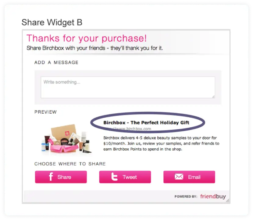
Result: Birchbox’s referral traffic grew by 2X by using a festival message. Use a holiday wish to generate interest among potential and existing users.
13. Add customer testimonials or pictures to your product page
Case in point: 37signals
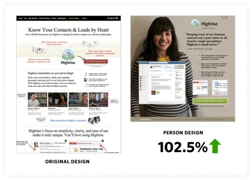
Result: 37signals changed the design of their product page by using a customer’s photo. Users found the woman’s picture relatable, as evident by a 102.5% improvement in conversions.
14. Have clear communication on your landing page
Case in point: Betting Expert
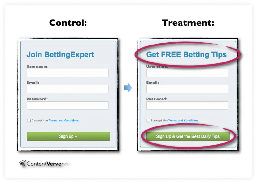
Result: Want to achieve a website conversion rate of 31.54% like Betting Expert did and reduce your bounce rate? Make your communication audience-centric, succinct, and precise.
15. Use a grid layout for your online shopping page
Case in point: Smartwool
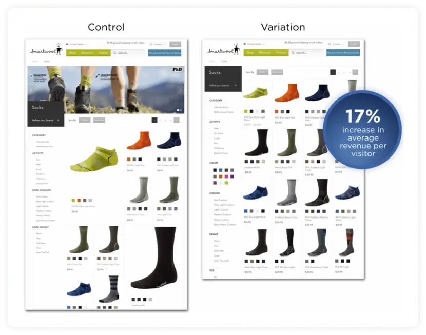
Result: Smartwool increased its conversion rates by going for a uniform website design. This strategy enables better eye tracking when a user scans the products on display.
Wrap up
Are you feeling inspired to start optimizing your campaigns? Run experiments, do testing, and get groundbreaking conversion rate optimization results today. And don’t stop there while you’re at it; measure your email marketing metrics too. Unlock success in your email marketing campaigns with Mailmodo. It’s YOUR time to make conversions!
What you should do next
Hey there, thanks for reading till the end. Here are 3 ways we can help you grow your business:
Talk to an email expert. Need someone to take your email marketing to the next level? Mailmodo’s experts are here for you. Schedule a 30-minute email consultation. Don’t worry, it’s on the house. Book a meet here.
Send emails that bring higher conversions. Mailmodo is an ESP that helps you to create and send app-like interactive emails with forms, carts, calendars, games, and other widgets for higher conversions. Get started for free.
Get smarter with our email resources. Explore all our knowledge base here and learn about email marketing, marketing strategies, best practices, growth hacks, case studies, templates, and more. Access guides here.


