Every application on my phone and laptop is set to dark mode. Because the last thing I want is to feel like a vampire getting burnt by the sun every time I check my emails in the morning. And I'm sure I'm not the only one.,
Yes, ideally, people shouldn't be checking their emails right after they wake up but let's face it, everyone does.
And some people just like the look of the dark aesthetic when reading their emails. So, it's up to you now as a business to create dark mode-friendly emails to help create a pleasant experience for your subscribers when they read your email in the dark mode.
Here we'll tell you all about the dark mode in emails and how you can make your emails dark mode friendly.
Table of contents
What is dark mode in emails?
Dark mode in emails is a setting in email clients which displays the email's components of text, email icons, and UI elements as light-colored on a dark background.
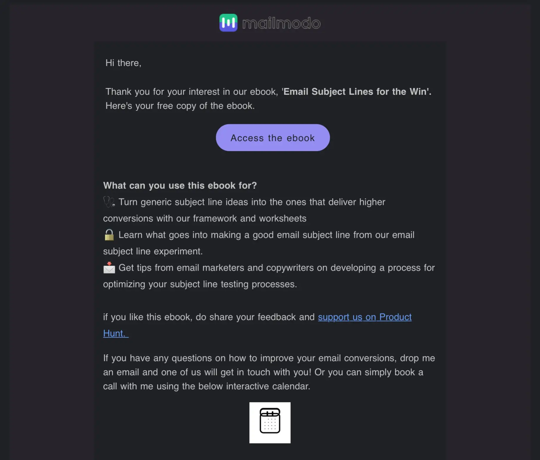
Dark mode example:

Light mode example:
What are the benefits of dark mode emails?
The dark mode is a rising trend for its dark aesthetics, but it has many benefits apart from just looking good. Here are some reasons why using dark mode can be advantageous.
✅ Better reading experience
The dark background in dark mode minimizes the amount of blue light and screen glare, making it easier for people to read your email even in low--light environments.
In addition, it is helpful for people who work at night since the dark background helps reduce the strain on their eyes when reading something at night.
✅ Battery saving
It is commonly known that using dark mode can help you reduce energy usage by your device's battery, but it's not that straightforward. Because if you use dark mode on devices with OLED (organic light-emitting diode) screens, you will be able to save energy while using it.
But, if you have a device with LCD screens, the dark mode doesn't impact battery life. This is because devices with OLED screens turn off pixels in dark mode, thus drawing no power, but LCD screens will use the same energy for both dark mode and light mode.
✅ Improves email accessibility
While the light mode is suitable for most people, some with visual impairments would benefit more from the dark mode.
For example, people with Cataract, Photophobia, ADHD, Myopia have a better reading experience when using the dark mode.
So by making sure your email renders well in both light and dark mode, you ensure that your email is accessible for most readers.
Read more - What Is Email Accessibility and Why Is It Important.
Do email clients support dark mode?
Like any other feature in an email, the support of email clients for the dark mode feature varies among email clients.
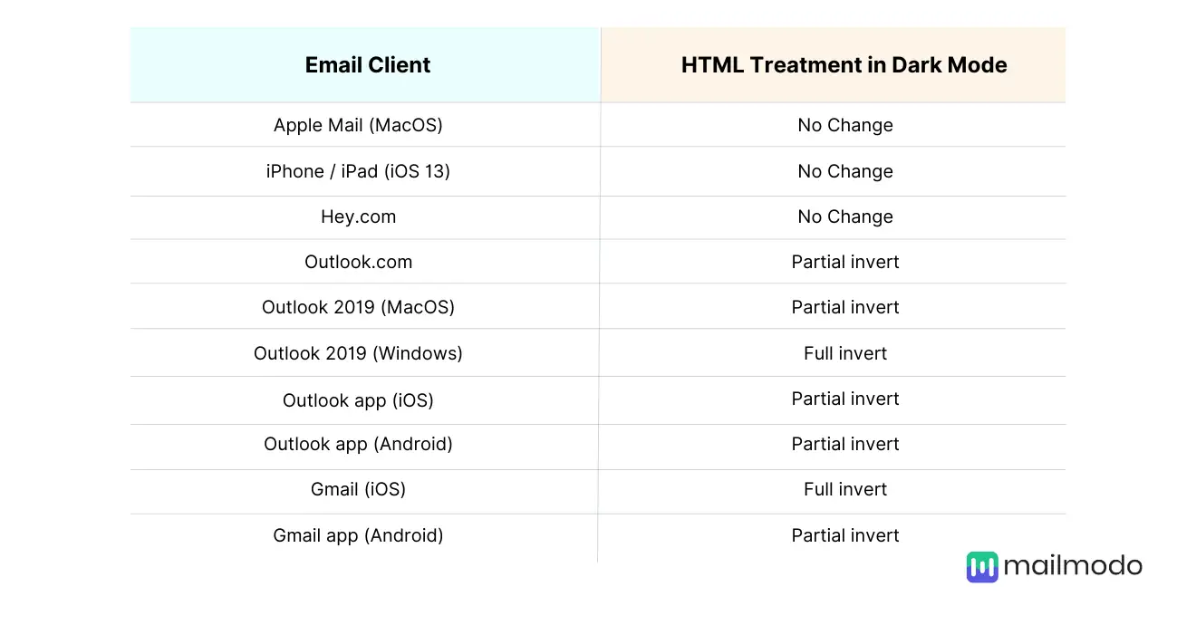
For example, here's the chart of email clients that support dark mode. Some partially or fully convert your emails into the dark mode, while some show no color change for HTML emails in dark mode.

Here's how email clients display dark mode emails by default:
1. No color change in dark mode
These email clients allow their users to select a dark mode in their settings but only change plain text emails to dark mode and don't change anything in an HTML email, as shown in the example below.
Examples of such email clients are Apple Mail, Hey.com.
Dark mode:
Light mode:
For these clients, convert pure white (#ffffff) background to a dark grey by including a <meta> tag for dark mode . But if you don't change it, you can use an off-white (#fffffe) background instead.
We'll cover this meta tag later on in the guide.
2. Partial color invert
Partial color invert is when email clients detect light backgrounds, convert them into dark backgrounds, and make the dark text light in color.
Here is an example of partial color invert by Litmus.
Email clients who show partial inversion are Outlook.com, Outlook app (iOS & Android), Outlook 2019 (macOS), Gmail app (Android).
These email clients show partial color invert as a default, but they also support targeted dark mode. So you can display custom dark mode emails through these clients.
3. Full color invert
Default full-color inversion by some email clients is the most meddlesome change amongst all the other default changes. It inverts both a light and dark background. So even if you have a dark-themed email, it'll make them light.
Email clients who do this are Outlook 2019 (Windows) and Gmail app (iOS).
In the examples above, the light background is converted as a dark version of the original color, and even the dark area with light text is converted to light with dark text.
How to optimize your email for dark mode?
Email clients automatically convert your emails, but this automatic conversion doesn't always work favorably. So it's best to optimize your email for dark mode. And here's what you need to do to optimize your email for dark mode.
1. Use transparent PNGs in the email
Transparent PNGs are images without a background and are usually indicated by a checkerboard pattern, as shown in the example below.
Using a transparent PNG lets you ensure that there won't be a jarring background for the image when email clients convert your email from light to dark mode. In addition, it will help improve the user experience when your subscribers read your email as they won't be subjected to bright backgrounds when reading in dark mode.
However, if you use transparent PNGs in your email, make sure to reduce the size before adding it to the email, as they generally have a larger file size.
2. Add a translucent outline to dark text transparent PNGs
If the transparent image of the logo or text is in black, then there is a high chance of it disappearing into the background in the dark mode, like shown in the image below.
You can add a white stroke or border around the black elements to make the logo or text visible even in the dark mode, as shown in the example below.
Also, the white element will just blend into the background when viewed in light mode.
3. Add code to customize your dark mode emails
We have seen how email clients render your regular HTML emails for dark mode can vary among different clients. So one thing you can do to control the way it is displayed is to use code to add your dark mode styles to the overall code.
Firstly, add the following metadata in the <head> tag to ensure that email clients recognize that you have a dark mode email version for those users who have enabled it.
<meta name="supported-color-schemes" content="light>
<meta name="supported-color-schemes" content="light dark">
Now, if you want a custom dark mode style in email clients like iOS, Outlook.com, Outlook App(iOS), Apple Mail, Outlook 2019(macOS), then you can add the media query [@media (prefers-color-scheme: dark )] to the embedded <style> section in your email code.
For example :
  /* Shows Dark Mode-Only Content, Like Images */
  .dark-img { display:block !important; width: auto !important; overflow: visible !important; float: none !important; max-height:inherit !important; max-width:inherit !important; line-height: auto !important; margin-top:0px !important; visibility:inherit !important; }

  /* Hides Light Mode-Only Content, Like Images */
  .light-img { display:none; display:none !important; }

  /* Custom Dark Mode Background Color */
  .darkmode { background-color: #272623 !important; }

  /* Custom Dark Mode Font Colors */
  h1, h2, p, span, a, b { color: #ffffff !important; }

  /* Custom Dark Mode Text Link Color */
  .link { color: #91ADD4 !important; }

}
If you want the same model to be supported in the Outlook app (Android), add [data-ogsc] as a prefix.
For example,
[data-ogsc] .dark-img { display:block !important; width: auto !important; overflow: visible !important; float: none !important; max-height:inherit !important; max-width:inherit !important; line-height: auto !important; margin-top:0px !important; visibility:inherit !important; }

/* Hides Light Mode-Only Content, Like Images */
[data-ogsc] .light-img { display:none; display:none !important; }

/* Custom Dark Mode Background Color */
[data-ogsc] .darkmode { background-color: #272623 !important; }

/* Custom Dark Mode Font Colors */
[data-ogsc] h1, [data-ogsc] h2, [data-ogsc] p, [data-ogsc] span, [data-ogsc] a, [data-ogsc] b { color: #ffffff !important; }

/* Custom Dark Mode Text Link Color */
[data-ogsc] .link { color: #91ADD4 !important; }
4. Test the dark mode emails
Now that you have created a dark mode email, it's time to test it out and see if it renders well for all email clients. You can use tools like Litmus, BEE editor to get a preview of how your emails look before you send them out.
From the preview, you can identify any mistakes and correct them for the final campaign. Make sure you test what your email looks like in both light and dark mode to see if the changes you have done works for both versions.
If you don't want to use any external tools, send the email to yourself and check both dark and light mode to see if it renders well. If you have a few different email clients, you can better understand how it'll look for your subscribers.
5. Modify your email design elements
Colors, CTA buttons, icons, your email that looked good in light mode may not translate the same way in dark mode. So it's best to check and design something that works for both modes.
In terms of color, sometimes, if the color is a bit too saturated, it can be harsh on the eye in the dark mode. So to avoid this, use a slightly muted color than the original color you intended to use such that it works for both light and dark mode like in the example below.
And make sure your social media icons are visible in the dark mode, as sometimes, if there are no outlines around the icon, it can blend into the background.
Use color intentionally for buttons or links to make sure there is a good contrast between the background and content to attract the most attention.
Wrap up
The most important thing for any business is to satisfy the customer's needs and if they want dark mode, then so be it.
It's our responsibility to respect their decision and create emails that work well in dark mode and provide a good user experience for the readers.
Yes, it is a pain in the butt to create specifically for dark mode, but it has to be done. And, we hope that the article made it easier for you to know what to do to create a well-designed dark mode email.
What you should do next
Hey there, thanks for reading till the end. Here are 3 ways we can help you grow your business:
Talk to an email expert. Need someone to take your email marketing to the next level? Mailmodo’s experts are here for you. Schedule a 30-minute email consultation. Don’t worry, it’s on the house. Book a meet here.
Send emails that bring higher conversions. Mailmodo is an ESP that helps you to create and send app-like interactive emails with forms, carts, calendars, games, and other widgets for higher conversions. Get started for free.
Get smarter with our email resources. Explore all our knowledge base here and learn about email marketing, marketing strategies, best practices, growth hacks, case studies, templates, and more. Access guides here.


