You’ve created the perfect email design, added the images, and written a compelling email copy. But, you left your email call-to-action as boring and non-actionable as “Learn more.”
Uh-Ohh! Don’t do that.
Just like other elements, your email call-to-action is as important, or should I say slightly more important, as it tells users where they should click and to take action.
So, make it personal, actionable, and valuable for your subscribers.
This guide will take you through steps to create an engaging email CTA that your subscribers can’t help but click.
Table of contents
What is email call-to-action?
A call-to-action reflects the end action you want users to take when engaging with your emails. It can be a phrase, text, or a button asking them to make a purchase, book a demo session, download an e-book, read your blog post, and so on.
Here is an example of a CTA button asking users to check out more features.
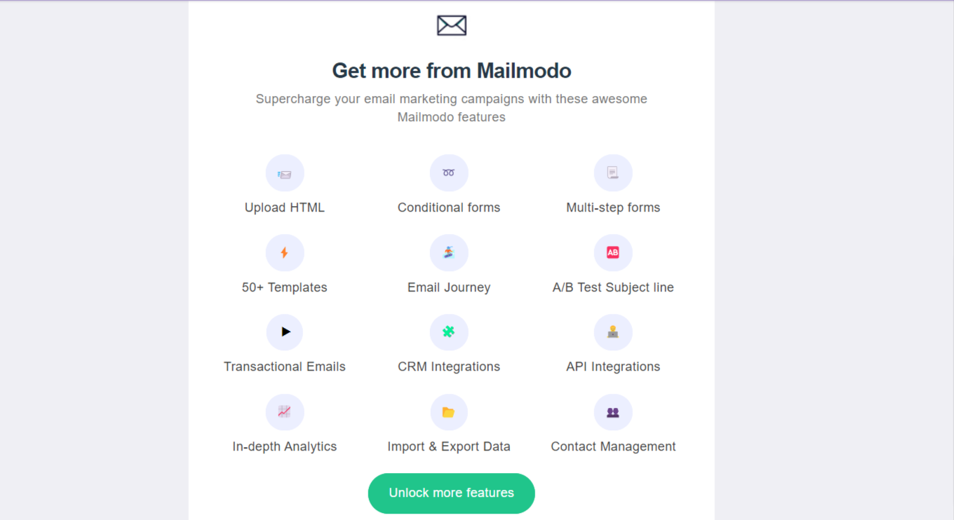
Email call-to-action is your prime engagement tool and will help you drive more clicks and increase conversions if done right. Besides, there are other benefits of using a compelling call to action in your email marketing campaigns.
Why is a call-to-action important in emails?
Every email you send has a purpose - to get more registrations, get users’ feedback, send them to your landing page, and so on. So, a good call-to-action becomes important because:
✅ It provides users with the right direction
A clear, compelling, and perfectly placed email CTA points users in the right direction and prompts them to take action.
✅ It improves click and conversion rate
A good CTA attracts user attention which helps build unique value propositions and trust. As a result, it leads to more clicks and conversions.
Types of email marketing CTA
Sometimes your emails may have more than one action that users can take. In that case, email CTAs are divided into two different categories:
Primary call-to-action
Your primary CTA is the main action you want your subscriber to take. Therefore, it should be easily recognizable and placed in the most prominent position in your email. One way to make your primary CTA stand out is by making it distinguishable from other email elements.
You can help your primary CTA stand out in the following ways:
Make the primary call-to-action a button.
Use enough whitespace around it.
Use a different color for the CTA button than the other design elements.
Use interactive elements such as hover effect or rollover effect.
Using bold and larger typography.
Secondary call-to-action
Your email may have more than one action. So, after primary CTAs, you want your subscriber to take any additional actions that are secondary CTAs. These should be styled and placed differently to prevent confusion and competition with primary CTA.
For example, if you use the hover effect in your primary CTAs, making secondary CTAs simple buttons will help avoid confusion and emphasize primary CTA.
How to create a compelling email CTA?
Before you begin creating your CTA, you need to define the purpose behind that CTA. Ask yourself these three questions:
What action do you want your subscribers to take?
How can you present it to your subscribers?
What value will it offer to the subscribers?
You must be crystal clear about the intent and reason why subscribers should click on that CTA button. Every CTA should aim to offer value to your subscribers in exchange for their time and attention.
So, spend some time and answer these questions. After that, you can think about creating CTA.
When you think about a call-to-action, there are three aspects you need to consider to create an amazing CTA:
Placements of call-to-action
Design of call-to-action
Call-to-action copy
We will discuss guidelines and best practices for each of these three aspects in the following sections:
1. Designing call-to-action
Here are different ways you can make email CTA design stand out:
• Use hover or roll-over effect
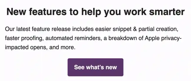
A hover effect is a visual effect that highlights and can give subscribers a clear signal to see what’s clickable.
For example, when users move their cursor over a link button or text, the hover effect results in color or style change of the element.
Source: Litmus
• Use bulletproof CTA buttons
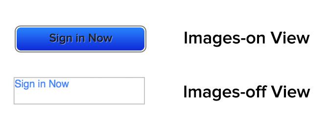
Bulletproof CTA buttons are built with a code instead of an image. By only using code, the button will display in all email clients even when images are turned off, which is what makes them “bulletproof.”
Source: Litmus
• Use adequate color contrast
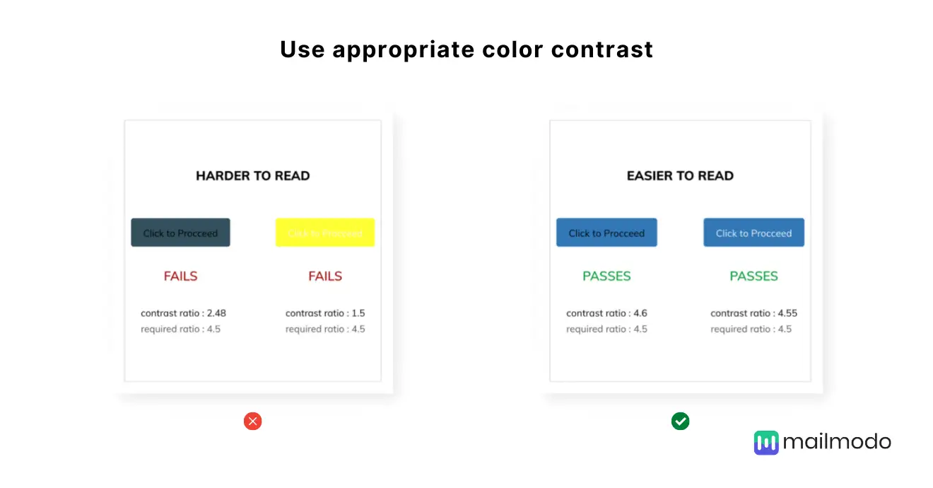
Your CTA button should be in alignment with the entire email color scheme. Bad or low color contrast can make email CTA difficult to read, creating a bad user experience. So, use high contrasting colors to enhance the user’s experience.
Besides, using adequate color contrast helps make your email CTA accessible to every user. As per WCAG guidelines, you should maintain a color contrast of at least a 4.5:1 ratio.
2. Writing call-to-action copy
Your CTA copy should meet the following:
Deliver what you promised in your email copy.
Offer value in exchange for the user’s time and attention.
Clarify the action users should take.
So, let’s discuss how you can achieve this.
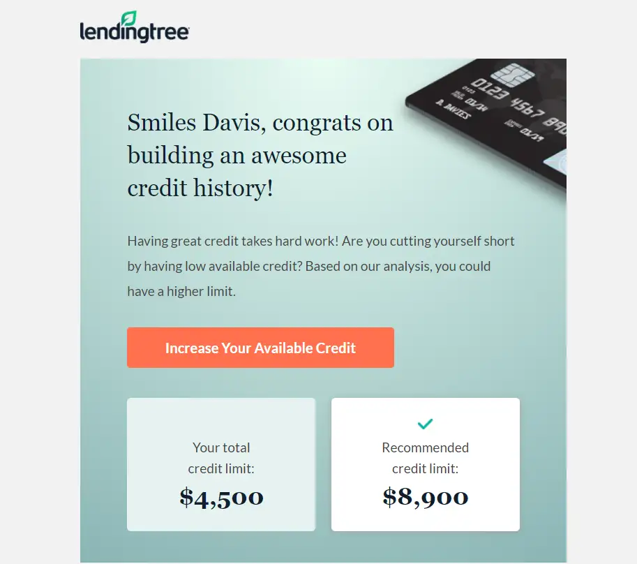
• Talk directly to your subscribers
When you talk to your subscribers, instead of giving them a command, it helps them connect with you and makes them click on that CTA button.
A recent study by Unbounce shows that when you speak to your subscribers using the first person pronoun, it results in a 90% increase in clicks.
Here is an email call-to-action example that speaks directly to subscribers.
Source: Really Good Emails
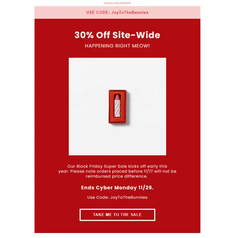
• Use actionable verbs
Phrases like “Learn more” ,“Click here” don’t specify an action and cause friction in the conversion process. So, use actionable verbs that tell users what to expect when clicking the CTA button.
Here is an example of using powerful verbs that state the action and set expectations for the user.
Source: Really Good Emails
Here are some more effective email call-to-action examples with actionable verbs:
Buy now and get 15% off and free shipping.
Check out our spring collection.
Take this 5 minutes survey.
Unwrap your birthday gift coupon.
Save your spot.
Share your feedback.
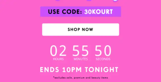
• Create urgency to encourage action
People respond fast to deadlines due to fear of missing out. So, create urgency in your CTA copy to compel users to take action right away.
You can use a countdown timer to let users know about the deadline to propel them to take action as soon as possible.
Source: Really Good Emails
Here are some more CTA examples that create urgency:
Start for just $1, today only.
Check out before 10 PM to get free shipping.
Holiday season: Book now to get 10% off.
3. Placement of call-to-action
CTA design and copy will only yield results if CTA is visible and placed in the most prominent position in your email.
So, where do you place it?
There is no right or wrong answer to this as it depends on your email layout, length of email copy, and number of CTAs in your email.
But here are some tips to help you with the placement of email CTA:
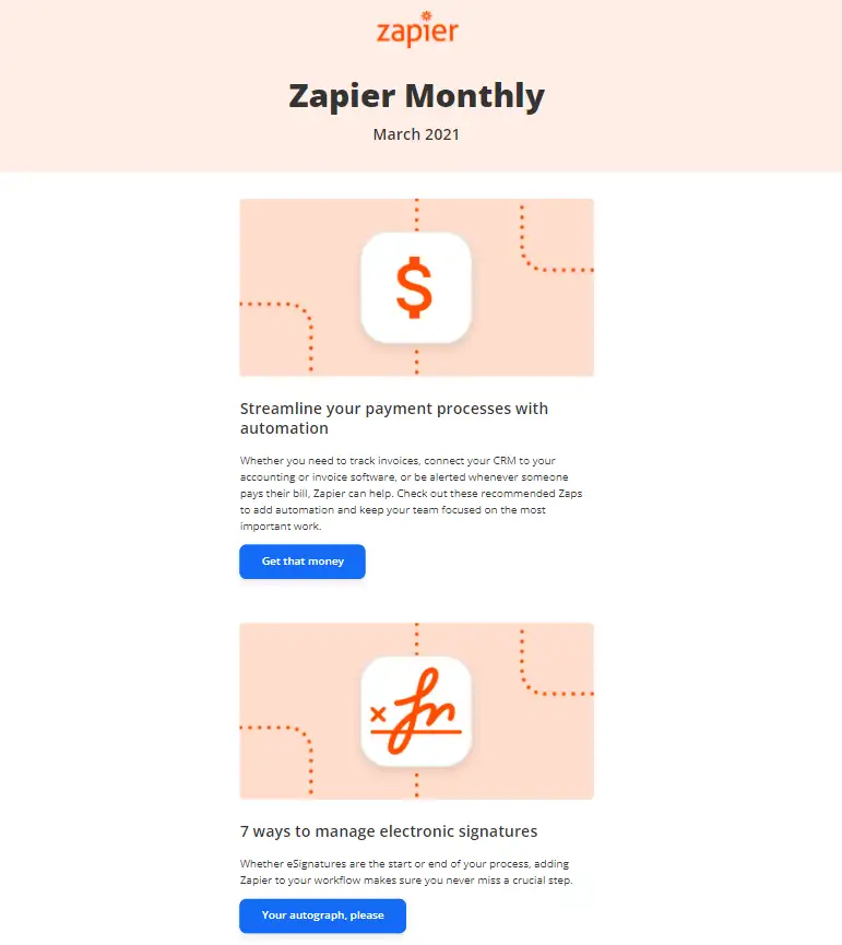
- If your email has multiple calls to action, like in a newsletter, then put them next to relevant content. Here is a CTA example by Zapier on using multiple CTAs and placing them.
Source: Really Good Emails
- If there is a single email CTA, it should follow the hierarchical structure as users read through it, just like in the example below.

Source: Really Good Emails
- You can put email CTA at the email’s beginning to create instant visibility among readers. The below example by Apple shows how to place email CTA at the email’s beginning.
 Source: Really Good Emails
One other aspect of CTA placement is to make it look clutter-free and easy to locate. You can do this with adequate white space.
Use white space around the call to action in emails
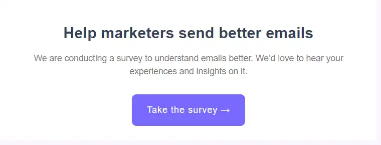
Leave adequate white space around the CTA to make it easier for readers to locate and identify it. Proper white space will draw attention to CTA and create a clutter-free experience for the reader.
In the example below, Mailmodo has put CTA in the center with adequate white space around it.
Now that we have covered the basics of email CTA, it’s time to learn some best practices to follow while you work on your email call-to-action.
Email call-to-action best practices
Here are the best practices you should follow while working on email call-to-action.
Be clear and direct, so there is no ambiguity around what action your user should take.
Create excitement in your email CTA to persuade users to enjoy the benefits now.
Optimize CTA for mobile, desktop, tablet, and other screen sizes and devices.
Optimize your email CTA through A/B testing.
Don’t forget to make your email CTA accessible for every user. To know how to do that, read our guide on email accessibility.
Optimize CTA button for dark mode.
Connect your CTA to your email message and the destination. For example, don’t make the user click on “Signup now to save $15” and lead them to your homepage. Instead, direct them to a landing page with a form that provides instant gratification.
Conclusion
Email CTA is fundamental to the success of your email campaigns as it helps improve email metrics like conversion rate and clicks. But to do that, you must follow email CTA best practices and aim to create compelling, engaging, and valuable calls to action.
Connect with your subscribers, lead them towards the end action and clearly define what action they should talk about. The more clear and personal your CTA will be, the more subscribers will take action.
What you should do next
Hey there, thanks for reading till the end. Here are 3 ways we can help you grow your business:
Talk to an email expert. Need someone to take your email marketing to the next level? Mailmodo’s experts are here for you. Schedule a 30-minute email consultation. Don’t worry, it’s on the house. Book a meet here.
Send emails that bring higher conversions. Mailmodo is an ESP that helps you to create and send app-like interactive emails with forms, carts, calendars, games, and other widgets for higher conversions. Get started for free.
Get smarter with our email resources. Explore all our knowledge base here and learn about email marketing, marketing strategies, best practices, growth hacks, case studies, templates, and more. Access guides here.


