When you send an email, you are entering the personal space of your users. That space is already filled with emails from friends, families, and other marketers. Thus, you need a valuable, relevant, compelling email design to stand out among such emails.
In other words, a good email design is indispensable if you want to be successful in email marketing.
But, where do you start since designing an email is not easy-peasy lemon squeezy? To help you, we created this email design guide covering components of email design, best practices, and trends.
Table of contents
What is email design?
Email design is the process of creating visually appealing email elements that attract and resonate with your email audience and help you get better ROI for your email marketing efforts.
For example, when decorating a home, an interior designer looks for the dimensions, color schemes, layout, arrangements of furniture, and much more. Designing an email is exactly like that.
Why does the design of the emails matter?
No matter how compelling a copy you have written, no one will read it if it's not presented using the right layout, formatting, and color. People who open your email and see a bad design will avoid reading further. This will impact your engagement rate and leave a bad impression on the reader.
That's why the design of the email matters. It strengthens your copy by giving it a visually appealing look and inviting readers to engage with it.
Configuration of email design components
While designing an email, you can use these configurations to make email components look more engaging and attractive to users.
| Elements | Meaning |
|---|---|
| Alignment | It refers to the positioning of elements in email. Alignments can be: Left, Middle, and Right |
| Border width | The width of all four sides of an element’s border is the border width. The four sides are left, right, top, and bottom. When the value of one side changes, it applies to other sides also. |
| Border radius | With a border-radius, you can adjust the roundness of corners of an element. The higher the radius value, the elements will get round corners. |
| Padding | Padding creates space around an element’s content inside any defined borders. The value of padding remains in pixels (px). |
5 crucial elements of an email design
Let's discuss essential components of an email that must be designed well to ensure better engagement and interactivity.
1. Email layout
The layout structures your email content and creates a flow of information as the reader moves from one section to the next. The more scannable your email will look, the more readers will be tempted to read it. That's why you need to get the layout right.
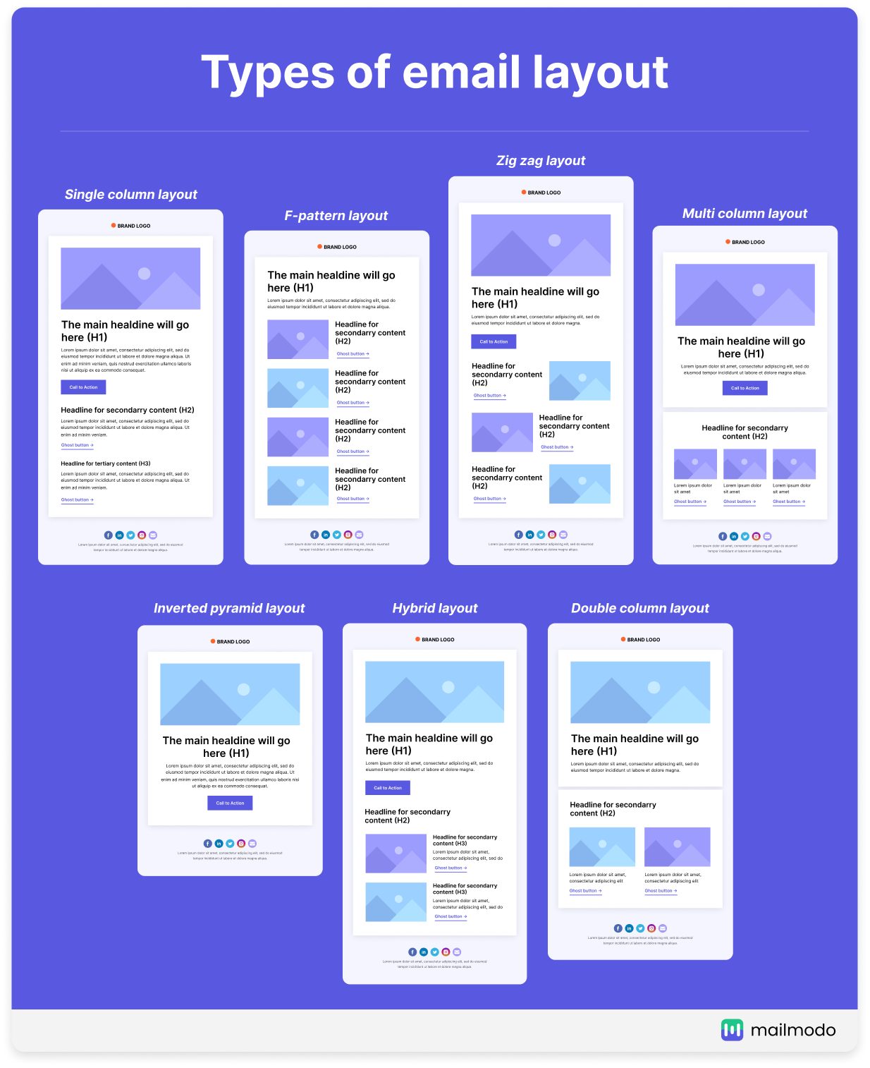
You can choose from a variety of email design layouts, such as
| Single-column | Multi-column |
|---|---|
| Inverted pyramid layout | Double-column |
| F-pattern layout | Zig-Zag layout |
| Hybrid layout |
Here's a visual representation of these email layouts:
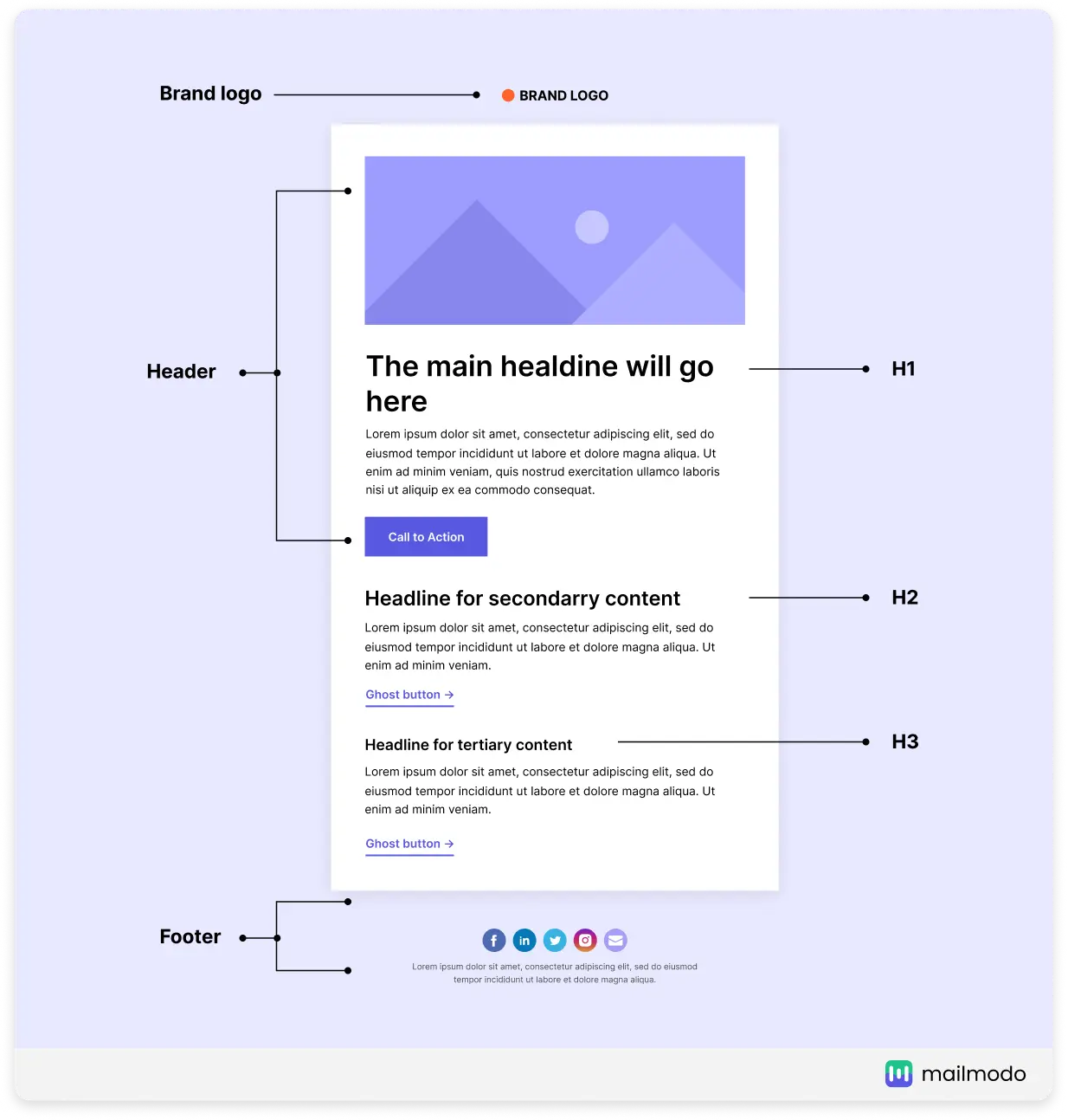
Let's demystify the most common component in an email layout:
Pre-header: It's the part that comes before the main header and usually contains the brand logo, navigational links, or 'view in browser link.
Top fold/hero: This is the part visible to the reader on their screen without scrolling. This part should capture the attention and compel readers to either click on the CTA (if it's in the top fold) or scroll to the reader further.
Email footer: The email footer is the bottom part of the email and often contains information like the social share button, unsubscribe link, privacy policy, brand address, etc.
Not only does a single-column layout make your email accessible to everyone, but they also create a better reading experience. Besides, more and more people view their email on mobile, so it makes perfect sense to use a single or inverted email because they look good on mobile devices.
💡Recommended email layout: Single or inverted email layout
2. Typography
One of the important aspects of typography is fonts. Typically fonts can be categorized as web fonts and web safe fonts.
| Web safe fonts | Web fonts |
|---|---|
| These fonts are pre-installed on an operating system. Example: Arial, Helvetica, Verdana, Georgia, Times New Roman. | These are pulled in from a web server and might not be installed on an operating system. If the recipient's email client doesn't support these emails, fallback versions with web-safe fonts will be displayed. Example: Baskerville, Courier new, Georgia. |
If your brand personality is classic and traditional, opt for Times New Roman or Helvetica. However, go for Open Sans if your brand style is fun and youthful.
While web fonts allow you to show your creativity, adding a fallback version is often advisable if you use them in your emails.
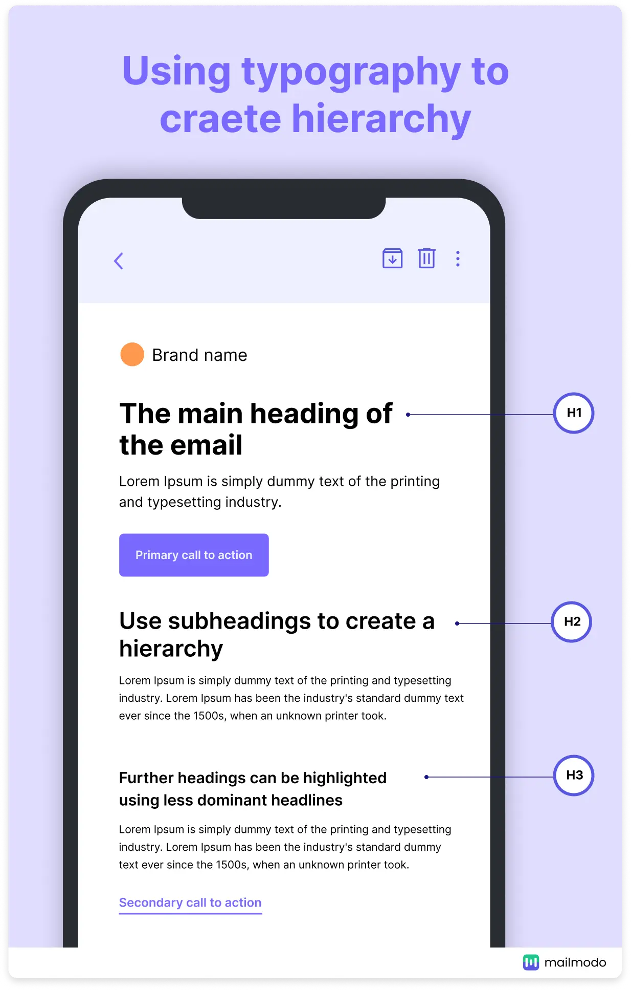
As the reader often scans the email, typography helps you create anchor points to take the reader's attention from the most important to the least. You can leverage the font styles, weight, size, and color.
Check the readability
Apart from the written text, how the text shows up in the recipient's inbox impacts the readability. That's why you need to keep an eye on typography.
The font size and weight should be such that readers can read the content without much effort. For better readability across all devices, font size should be readable and easy on the eyes.
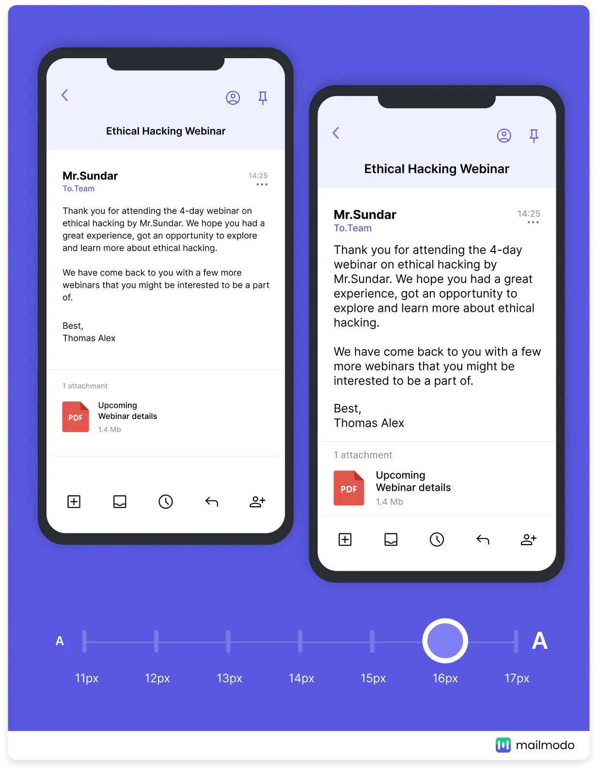
💡Recommended font size: 14px-18px and headline between 20-36px
3. Imagery
The imagery makes your email more appealing. It's your chance to show your brand value by adding your image assets such as graphics, logos, banners, etc.
But, you cannot add an image and call it a day. A good email design considers everything, such as image file type, the load time of the images, accessibility, and types of images to add.
Types of imagery
If you use static imagery, PNG and JPEG are the best formats.
For animated images, we recommend using GIFs or APNGs.
Size of the image
Images play a huge role in deciding the size of the email. So, try to keep their size as low as possible by compressing them. You can use design softwares like Adobe Photoshop or online free tools such as TinyPNG and TinyJPG to reduce the image size.
Iconography
Along with images, you can add icons to make email content visually attractive such as social media icons. Icons help illustrate list items, steps, or processes, create a visual hierarchy, and work as anchors such as arrows.
While adding icons, make sure they support the text. (if you're using them next to text).
💡Recommended image size: Less than 1MB
One thing to remember while adding images is not to use generic images that don't add value. Images should be relevant to the email copy. Also, if you're downloading stock images, consider licensing and copyright. Add images only after obtaining permission from the source.
4. Buttons
Buttons are the clickable element that is used for email call-to-actions. Ask yourself how you would like to add your CTA button:
Rounded or square edges?
With or without spacings?
Outlined (ghost button) or with a background color?
Based on the number of times these buttons appear, these can be divided into two categories:
Primary CTA buttons
The main action you want the recipient to take. So, it should be placed in a prominent position and must be bible at once to the reader.
Secondary CTA buttons
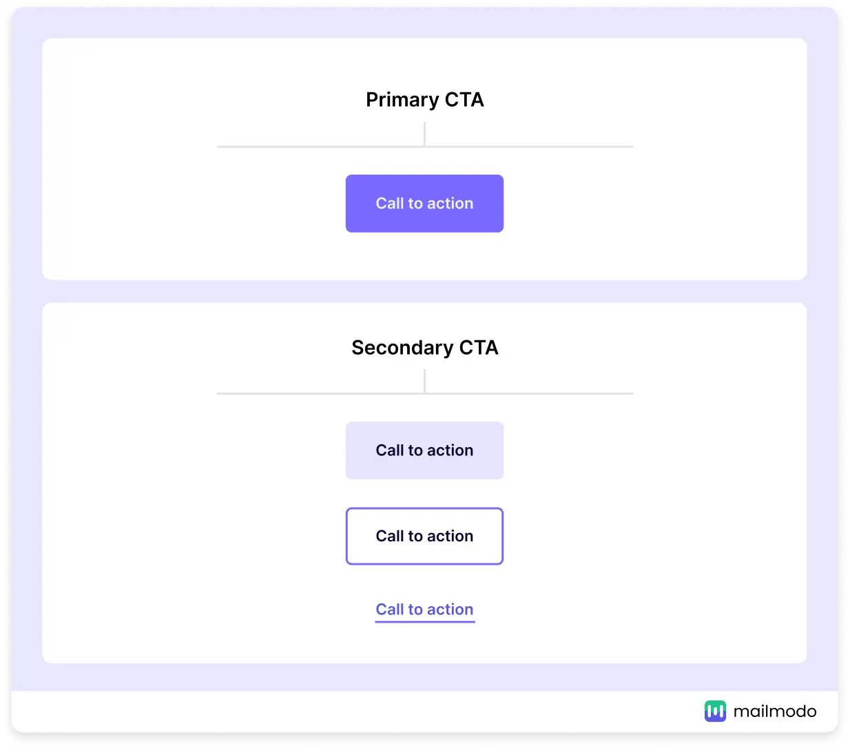
Any action you want users to take apart from the main action would be considered secondary. You must distinguish these CTA from the primary to not divert the user's attention from the major action. You can do this by:
Using a light color than the primary CTA
Using a different button design
Reducing the size of the button
Here's an example of how to differentiate primary CTA from the secondary CTA button.
Bulletproof buttons
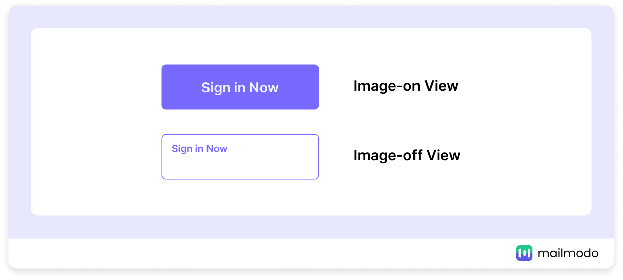
It becomes bulletproof when you add a button by coding it instead of adding it as an image. That's because an image-based button won't render if the recipient has turned off the images or the client doesn't support them. But, the bulletproof button doesn't have any such drawbacks.
Here's how both these buttons will render (notice the rendering and alt text in an image-based button)
💡Recommended button size: 42px height for mobile versions and 72px for desktop. The width depends on the CTA copy.
5. Color
Color evokes emotional responses and sends signals to the brain. A yellow color calms the mind while a red alerts the reader. Understanding how different colors work in email is essential to convey your message.
Defining the right color is tricky as the definition varies from brand to brand. Some brands use light, monochromatic colors to show their identity, while others opt for bold and vibrant colors.
Besides, color themes should change depending on the type of campaign you're creating. For instance, a holiday email campaign should have a color that signifies that occasion. A Christmas email should use a red, blue, and green color theme, while a black Friday email should have a black or red theme.
Related guide: 11 Email Design Trends That Will Boost Email Engagement in 2022
Email design and accessibility
Every component of your email must be accessible so that people with disabilities can read and understand them. It's not only a human thing to do but also shows that you care about your audience.
Let's talk about a different aspect of accessibility:
1. Responsive email design
As the rate of mobile users increases, different design components should render well on mobile and other devices. If your emails are not responsive, some parts will get cut off, making them inaccessible for the reader.
Not only does responsive email design matter for accessibility, but it's non-negotiable to create a better experience for your readers.
2. Color contrast
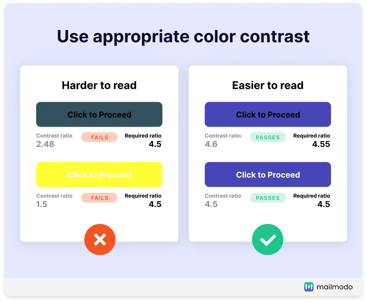
Color contrast is the difference between an element and the background on which it sits. A low color contrast will make it hard for people with color blindness to access and read the text.
Web Content Accessibility Guidelines (WCAG) introduced by The World Wide Web Consortium (W3C) reveals that for standard-sized text, use a contrast ratio of at least 4.5:1. With font size larger than 23px or bold text larger than 18px, the ratio should be at least 3:1.
3. Focus on readability
We discussed that typography impacts the readability, but it's only half the picture. Other things to keep in mind to maintain readability are as follows:
Left align your email copy as it helps screen readers to read better. Also, humans tend to read from left to right. So, it creates a better reading experience.
Avoid center-aligned copy as it makes people with dyslexia read.
Add white space by dividing longer paragraphs into shorter paragraphs to reduce the mental load while reading.
Keep line height to 1.5 to 2 times the size of the text. (recommended by the W3C)
Use the font size of at least 14-16px for copy and 20-24 px for headlines.
Learn more about how to make email accessible in detail.
Email design examples to inspire you
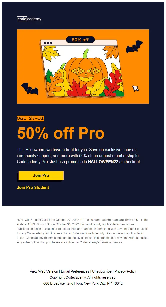
Now that we have covered the basics, you must be tempted to see all these components in action. Brands in different industries are creating amazing designs that have captured our eyes and kept us hooked.
1. Halloween email from Codecademy
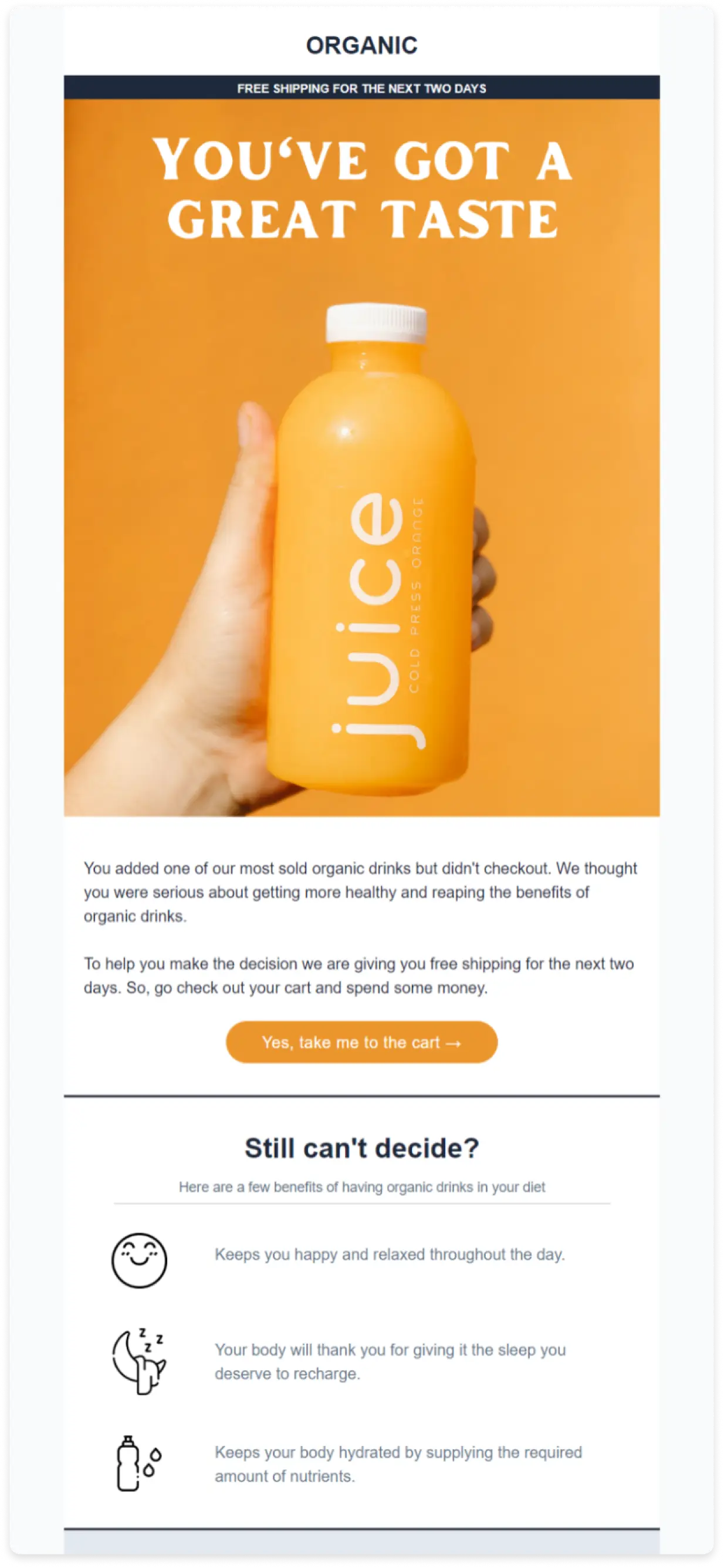
2. Cart abandonment email design template from Mailmodo
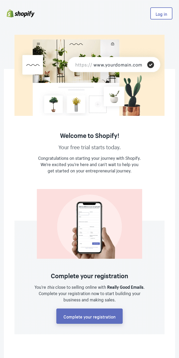
3. Welcome email from Shopify
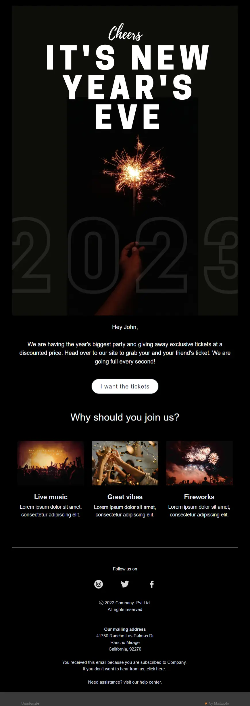
4. New year email design template from Mailmodo
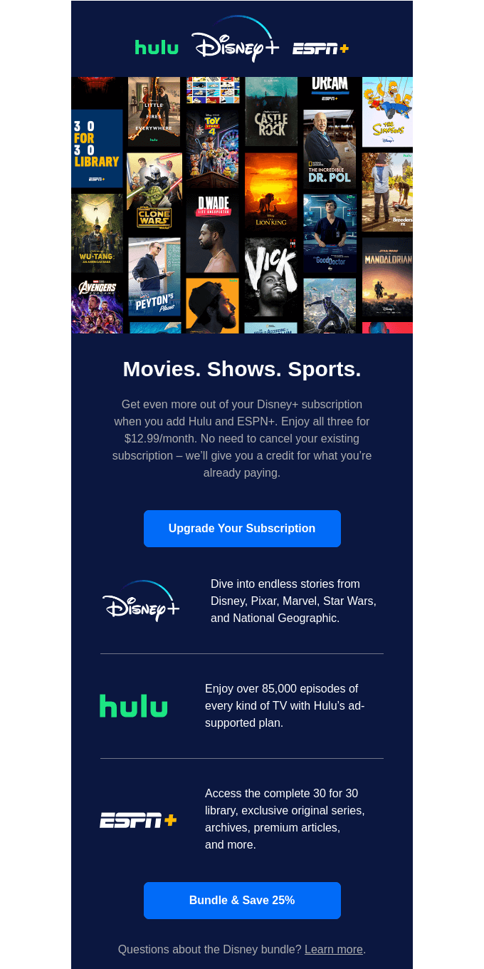
5. Upselling email from Disney
🔍 Related read: 11 innovative email design examples for different industries
11 email design trends to check out in 2023
Besides following all the best practices, one thing that can boost your campaign's performance is following the latest trends in the design industry.
People love to see trendy and creative designs within the email as it breaks old myths that emails are boring and you can't do much creativity there.
But from bold typography and dark mode to gradient color themes, there are a lot of trends going on in email designs that you can leverage to amaze your audience.
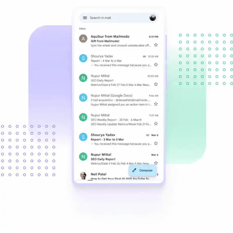
Here are some crazy things you can do with Mailmodo:
1. Wheel spinner inside the email
2. Wordle game inside an email
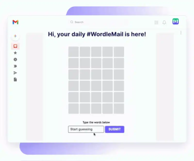
Intriguing right?
🔍 Related read: 11 trendy email design examples for 2023.
How to design emails in Mailmodo’s no-code template builder
Since our's is a no-code template builder, you don't need coding skills to create stunning emails that wow your audience.
So, first, you need to select the template. You can choose from our existing template library or create a new one from scratch. The former is advisable if you're just starting and want a foundation to build your template.
Once you choose the template, you can make all sorts of customization to it
Change the brand logo
Play around with different email layouts
Add status and dynamic images
Add different content blocks
💡Quick hack: If you choose to build an email from scratch, you can still get inspiration from our pre-made content blocks.
There are different content blocks to help you create an email in less time, from header to footer and everything in between. You can make your content blocks and save them to reuse them for future emails.
For a detailed breakdown of how to design an email in our template builder, here's a video for you:
Email design best practices
Here is the list of things you should follow to create an email design your customers love. We also attached a downloadable checklist below so that you can use it while designing your emails.
Make the email layout scannable and easy to read.
Use a single-column and inverted email layout.
Use web-safe fonts such as Arial, San-serif, or Serif.
Format your email with HTML tags.
Use line-height 1.5 to 2 times the text size per W3C.
Use PNG and JPG for static images.
For animations, use GIF or APNG format.
Use bulletproof buttons and avoid image-based buttons.
Make the primary CTA button more actionable and prominent.
Maintain color consistency to make people remember you.
Maintain a color contrast of at least 4.5:1 for standard font size.
Always add descriptive alt text to the images.
Use shorter paragraphs to avoid mental load for people.
Avoid all-image-based emails.
Make each design component responsive.
Get a complete email design checklist for free in a downloadable format. All you have to do is click on the link and make a copy of the document.
5 email design tools to create stunning emails
Here are a few popular email design tools that you can use to design emails effortlessly.
1. Mailmodo
Mailmodo's all-in-one email marketing platform comes with a simple and easy-to-use email template builder that lets you create both HTML and AMP emails.
Popular features:
WYSIWYG editor
Drag and drop editor
Re-usable premade content blocks
200+ free email template designs
AMP email support
Dynamic email content
No coding skills are required
And more.
Check out Mailmodo by booking a free demo.
2. Stripo
Stripo is exclusively made for email design and development. It can't help you with sending emails. You can create beautiful and rich HTML email designs with Stripo's editor.
Popular features:
Drag and drop editor
HTML and CSS code editor
Responsive and free email templates
AMP email support
Integrates with 70+ ESPs
3. BEE
BEE is another email design software to create responsive and mobile-friendly emails and landing pages.
Popular features:
Drag and drop editor
Export templates anywhere
Ready to use email templates
No-code development
Integrates with other ESPs
4. Chamaileon
Chamaileon is an online email template builder and content management platform that helps you create beautiful emails and store the assets used in the email.
Popular features:
Create complex email layouts
Built-in CMS to manage email assets
Collaborative email design
5. Postcards
Postcards by Designmodo is another exciting tool for creating your email template design. It is an HTML email creation platform and doesn't support AMP or interactive emails.
Popular features:
Drag and drop editor
Export to various ESPs
Collaborate with teammates
Store and backup your designs
100+ free email templates
Final thoughts
Matthew Smith, the founder of Really Good Emails, believes that
Email is on the brink of becoming a far more powerful medium that will allow email designers to curate all types of media right inside users' more fully evolved inboxes.
Along that thought, Mailmodo is already paving the way for making email dynamic and interactive. Adding a live RSS feed in the email to shopping carts brings a web-like experience to the emails. Check out our library of 200+ pre-made email templates and get a glimpse into the endless possibilities opened up due to AMP emails.
What you should do next
Hey there, thanks for reading till the end. Here are 3 ways we can help you grow your business:
Talk to an email expert. Need someone to take your email marketing to the next level? Mailmodo’s experts are here for you. Schedule a 30-minute email consultation. Don’t worry, it’s on the house. Book a meet here.
Send emails that bring higher conversions. Mailmodo is an ESP that helps you to create and send app-like interactive emails with forms, carts, calendars, games, and other widgets for higher conversions. Get started for free.
Get smarter with our email resources. Explore all our knowledge base here and learn about email marketing, marketing strategies, best practices, growth hacks, case studies, templates, and more. Access guides here.


