We live in a world where people's attention span is reducing daily. So it's unrealistic to expect your audience to read everything you've written when they scan your email.
That's where design comes to the rescue. With a proper email design, you can make the email easy to understand even with a quick scan, direct them to CTA, and achieve your email campaign goals.
However, it can be hard to choose which design is suitable for your business and how to get promising results from your campaign using email design.
So in this article, there are 11 email design examples for different industries to help you discover the right design for your email marketing needs.
Table of contents
- Best email design examples to gather inspiration for your next campaign
- 1. Real estate
- 2. Banking and financial
- 3. Entertainment
- 4.Automotive
- 5. E-commerce
- 6. Home & Interiors
- 7. Education
- 8. Fashion
- 9. Gaming
- 10. Art
- 11. Food and Beverages
- What's next
Best email design examples to gather inspiration for your next campaign
Here are some email design examples you can take inspiration from:
1. Real estate
As a company dealing with real estate, it can send several types of emails to its leads. They can send anything from emails showcasing top available establishments to newsletters talking about responsibilities that come with homeownership, etc.
But you can do much more using AMP when creating your email templates. AMP helps you make your emails dynamic. You can use it to collect data from readers in real-time through surveys within the email, like in the example below.
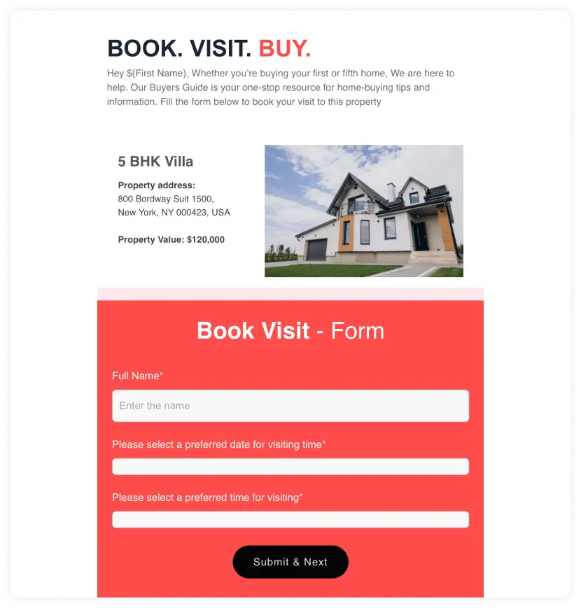
Source: Mailmodo email templates
Why did this design stand out for us?
Simple design
Uses AMP factor
Clear CTA button
2. Banking and financial
Financial organizations send their prospects transactional emails, promotional emails, etc. They provide their leads information about the services and policies available they don't know about.
You can use hybrid or multiple-column layouts when designing your emails. It would help you segregate and organize emails more efficiently than a single column or inverted pyramid layout.
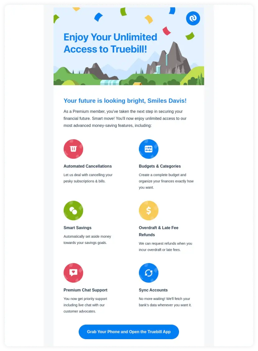
Source: Really Good Emails
Why did this design stand out for us?
- Clear layout
- Good readability
- Clear CTA
3. Entertainment
Entertainment is another creative field where you can use any email layout to create a beautiful campaign because the content will catch the eye no matter what.
Here, Netflix uses the multiple-column layout to show their top trending shows. They use AMP for emails to add a feedback form to know more about their readers' interests and find out what they like or dislike.
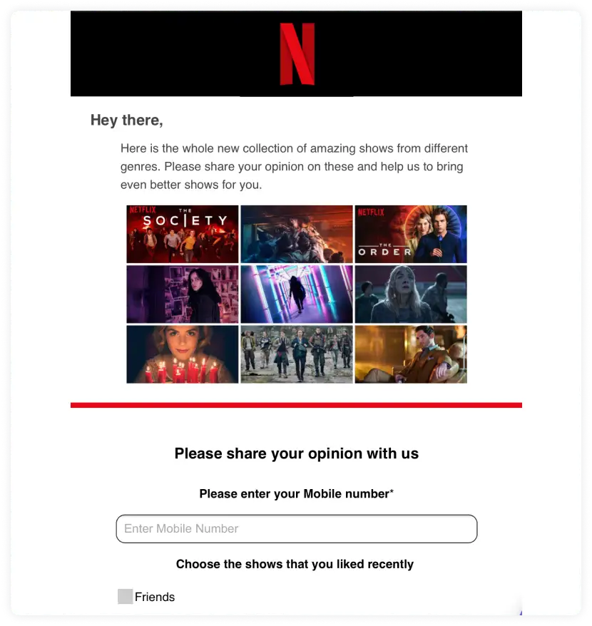
Source: Mailmodo templates
Why did this design stand out for us?
- Interesting layout
- Cohesive colors and fonts
- AMP factor
4.Automotive
The automotive industry uses emails to send updates about product launches, events, product details, etc. However, they don't use it to get any sales directly from the email apart from pre-booking.
So for the automotive industry, it's beneficial to use a single column or inverted pyramid layout like in the example below.
Use images at the top to capture the audience's attention. Then, you can provide more information about the product in the email below the call-to-action.
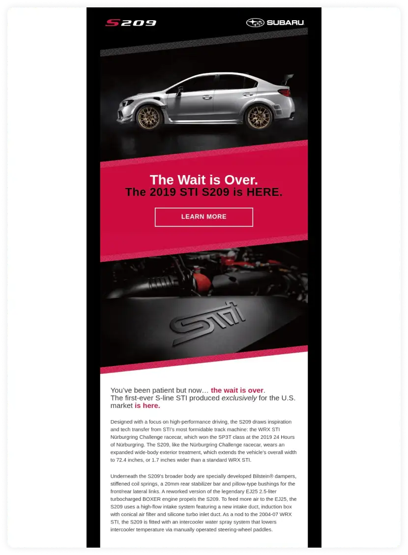
Source: Really Good Emails
Why did this design stand out for us?
- CTA grabs attention.
- Images are stunning.
- Layout is straightforward.
5. E-commerce
E-commerce businesses send all emails from product announcements and offer to cart abandonment. Still, they mainly use email marketing to send promotional emails to help increase sales. So to get the most amount of sales, it's best for e-commerce companies to use a single-column or inverted pyramid layout for their email design.
You can also switch up how you send product recommendation emails to your audience by making it an amp email. By using AMP emails, you provide users the ability to buy products directly from the email.
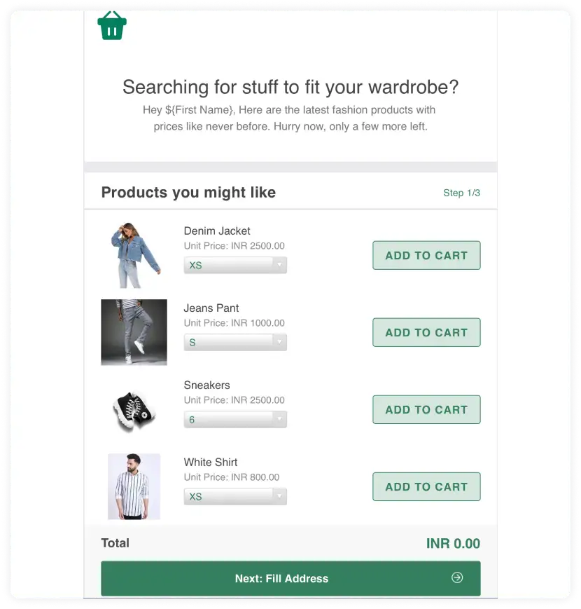
Source: Mailmodo templates
Why did this design stand out for us?
- AMP factor
- Simple layout
- CTA grabs attention
6. Home & Interiors
The home and interiors industry comprises companies producing furniture, appliances, decor, etc. Hence, the hybrid layout will be perfect for this industry as they have the versatility to showcase a top product and other similar products.
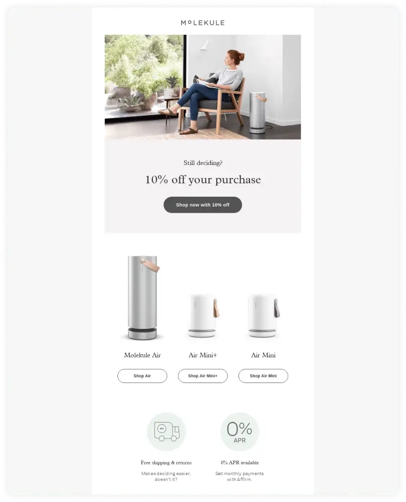
Source: Really Good Emails
Why did this design stand out for us?
- Minimal design
- High readability
- CTA grabs major attention
- Simple and clean imagery
7. Education
The education industry uses emails to get people to sign up for courses or showcase popular classes. They can use standard or more intricate templates based on their audience. They can keep the email design minimal for a mature audience and colorful for younger audiences.
They can use AMP emails to get people to register for their courses within the email itself. It helps to keep people engaged in the email rather than redirecting them to a separate web page.
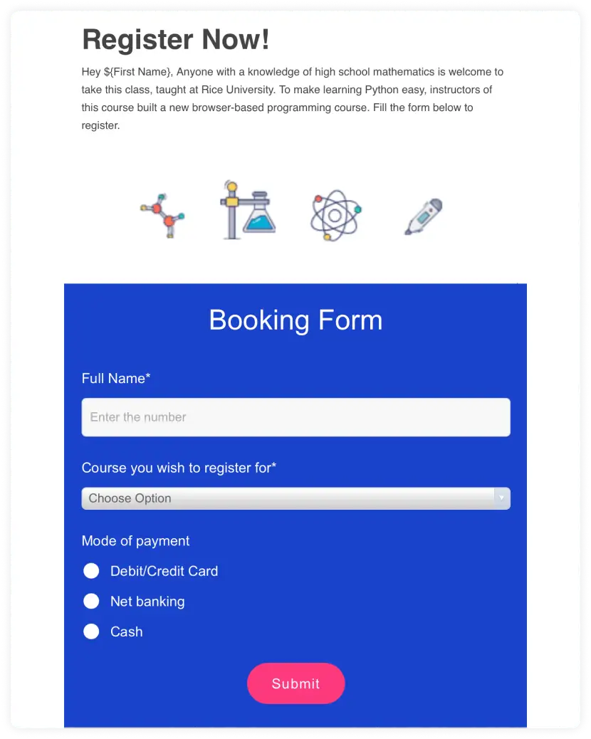
Source: Mailmodo template
Why did this design stand out for us?
- Simple layout
- AMP factor
- CTA is clear
8. Fashion
Nowadays, the fashion industry has been more focused on the online platform, so they use emails to promote products and drive sales.
Previously the fashion industry used single-column layouts to create their promotional emails. But nowadays, you have more options available to you, and to get more sales, you can use the inverted pyramid layout.
You can also use a hybrid layout to create promotional emails, as in the example below. Forever 21 gives a discount and uses dynamic personalization to show them products that interest them.
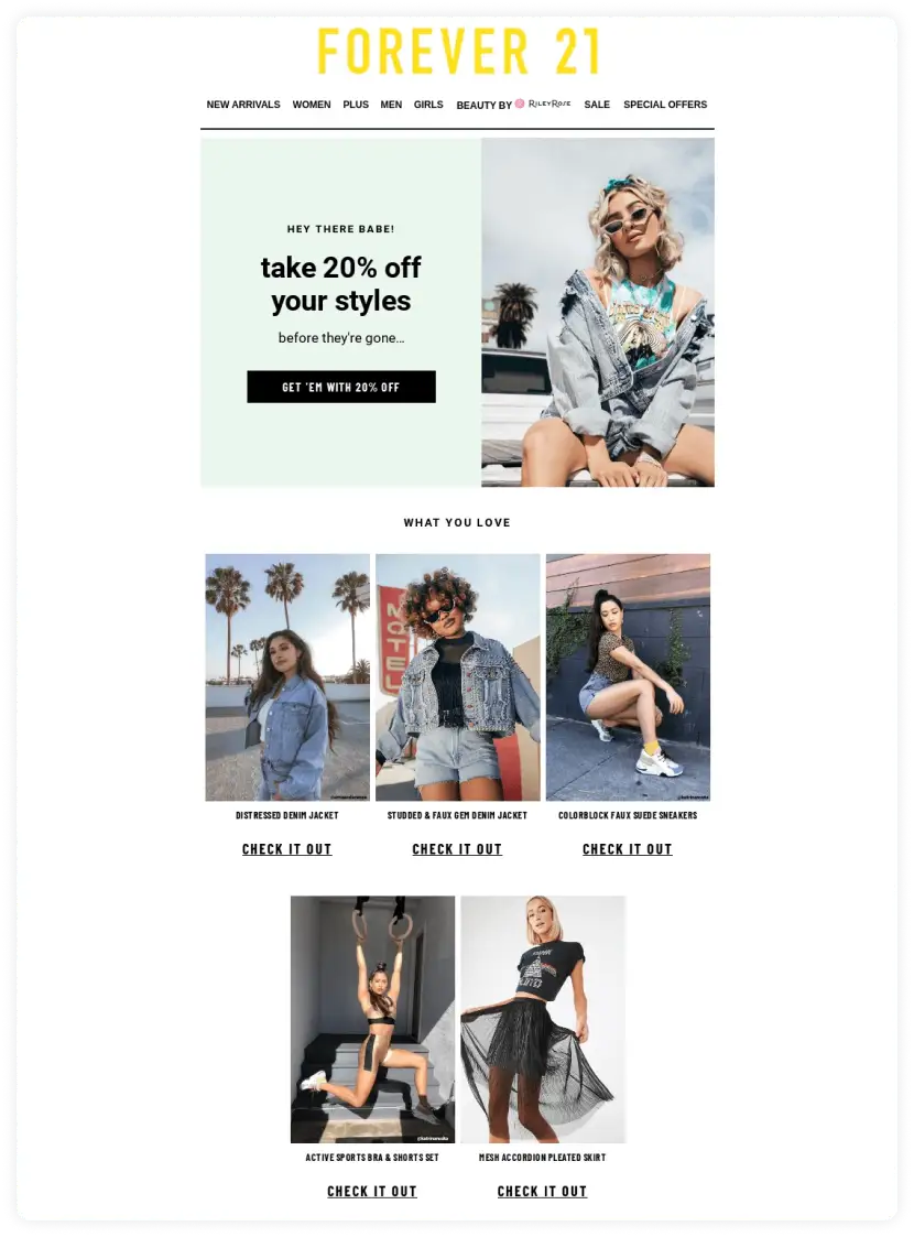
Source: Really Good Emails
Why did this design stand out for us?
- Clear CTA
- Great layout
- High readability
- Captures attention with the images
9. Gaming
The gaming industry has similar email marketing needs as the automotive industry. They help with new releases and provide more information about the new product. But, they also use emails to drive people to download or buy their games.
The gaming industry can take the liberty of using multiple high-quality images in their emails. It can be the most crucial element to help the subscribers visualize what the game would be like.

Source: Really Good Emails
Why did this design stand out for us?
- Stunning imagery
- Simple layout
- Uses bold fonts to draw attention
- Vibrant color palette
10. Art
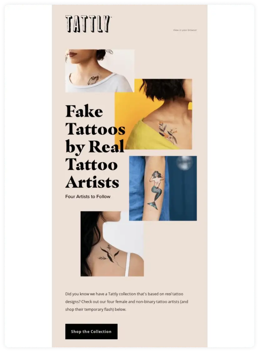
The art industry is undoubtedly a creative field. Depending on the art, they can use a standard single-column layout or something more complex like the zigzag layout.
Here, Tattly has taken the creative liberty to use zigzag elements in a single-column layout, making it more interesting. Also, they have made sure the email design is minimal so that the artwork stands out.
Source: Really Good Emails
Why did this design stand out for us?
- Interesting layout
- High readability
- CTA grabs major attention
11. Food and Beverages
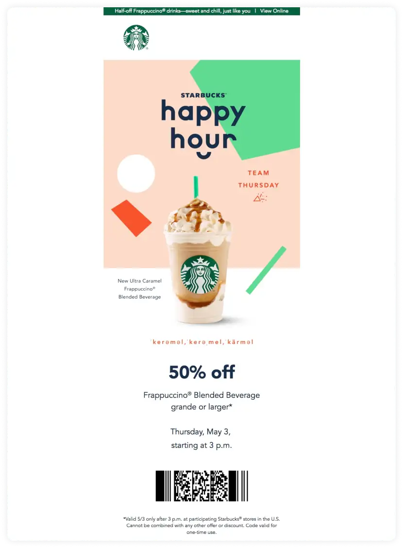
Usually, the food and beverages industry sends out emails containing coupons or special offers. So, a single-column layout will be suitable for such offers or promotional emails. Besides, a single-column email makes it simple and easy to understand the email as it has one main image followed by a single call-to-action.
For example, Starbucks has sent out an offer email to its subscribers about their exclusive one-day offer. They have used a single image showcasing the featured product and its call to action.
They have made their call-to-action more suitable for their offline business. So if you are also a brick-and-mortar shop, you can use a similar call-to-action.
It shows that you don't necessarily have to use a button to solicit a call-to-action in emails.
Source: Really Good Emails
Why did this design stand out for us?
- Beautiful imagery
- High readability
- Unique CTA
The average person skims an email in a total of 13 seconds.
— Connie Cen | SMS + Email Marketing 🚀 (@Conniesends) June 19, 2022
Make sure you have these things to make your email design pop:
Big font
Different heading fonts
Bold
Italics
Images/gifs
Vibrant colors
💡 Related read: 17 restaurant email marketing strategies to win diners
What's next
Now that we have covered a few different email design examples, it's up to you to decide which layout and design best suits your email marketing needs.
If you don't know where to start, check out Mailmodo, we provide ready-to-go templates for creating AMP emails, from surveys to abandoned cart emails.
You can modify any of the templates to fit your needs.
What you should do next
Hey there, thanks for reading till the end. Here are 3 ways we can help you grow your business:
Talk to an email expert. Need someone to take your email marketing to the next level? Mailmodo's experts are here for you. Schedule a 30-minute email consultation. Don't worry; it's on the house. Book a meet here.
Send emails that bring higher conversions. Mailmodo is an ESP that helps you to create and send app-like interactive emails with forms, carts, calendars, games, and other widgets for higher conversions. Get started for free.
Get smarter with our email resources. Explore all our knowledge here and learn about email marketing, strategies, best practices, growth hacks, case studies, templates, and more. Access guides here.


