You've created the landing page that ticks all the right boxes but is it generating traffic per your expectations? Are users engaging with it or bouncing off without clicking? Or are you meeting the conversion goal you set up for a particular landing page?
If your landing page is not performing, that'd be a big problem because it implies that you failed at creating a great first impression and hooking your visitors. So, now you need to optimize your landing page by figuring out the issues and drop-off points.
Our landing page optimization guide will help you identify such issues and discuss optimization strategies to refine your landing page elements to grab users' attention and increase conversions.
Table of contents
What is landing page optimization?
Landing pages are the core elements of your marketing strategy as they work as your pitch to the visitors for your products or services. These are the pages you direct users through your paid campaigns, social media, or any other channel.
Users get to know about what you offer, get familiar with it, and develop trust and credibility landing pages. So, if your landing page is not optimized, you will see lower conversions and low ROI.
Landing page optimization is about improving and enhancing different elements on your page - copy, visuals, CTAs to increase engagement and conversions. It requires a thorough analysis of users' behavior and interaction and a/b testing to get the versions that seem more profitable and engaging.
Benefits of landing page optimization
A huge amount of marketing budget and energy goes into pitching your product/service to the visitors to get more conversions. If that landing page is not getting expected conversions, you are losing your ROI and your time and effort.
An optimized landing page will help you generate more leads.
A landing page optimized for SEO will help you rank higher in SERP, thus giving it more visibility. The higher it ranks, the more organic traffic you'll get.
Help you lower customer acquisition costs and maximize your ad spend value.
The performance of your landing pages is critical as it impacts the performance of expensive marketing work - whether that's paid performance marketing or community engagement.
Related guide: How to Create a Successful Customer Acquisition Strategy to Grow Your Business
How to carry out landing page optimization
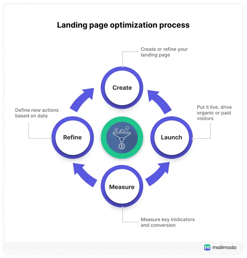
Here is a step by step process of optimizing your landing page:
Step 1: Identify areas of improvement
After you launch your landing page, you need to check the performance - traffic generated, clicks, scrolling activity, users’ behavior, etc.
One of the best ways to ascertain the performance is to use heatmaps. A heat map will show where users are clicking and which element is most prominent on your landing page. It helps you understand whether users focus on your CTA or less important elements.
The warmer colors like red or orange show the most popular areas. But cool colors like blue or purple denote the least clicked and engaging elements.
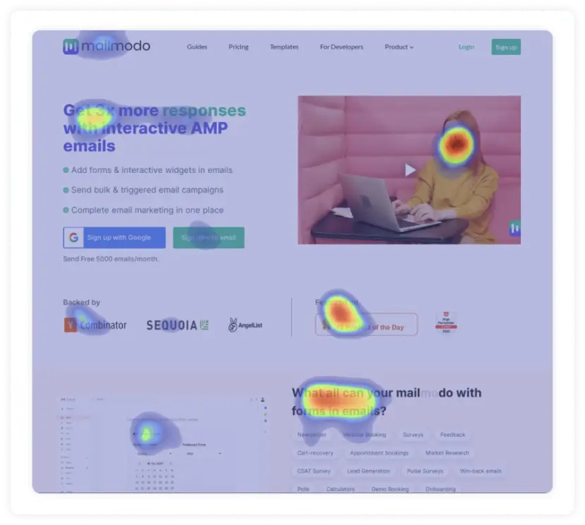
We’ve written an in-depth guide on using heatmap. You can read it here: How To Use Heatmaps to Analyze Your Website Performance.
Step 2: Make the changes
Here you'll refine your landing pages - the design team, copywriters, and developers will come in handy in this stage. Here are the improvements you should make if users are not converting:
Above the fold: Heading, subheading, CTA, Social proof, and imagery.
Below the fold: Features, benefits, testimonials, visual elements, CTA.
Above the fold optimization
It's the first part that is visible to the user as they open your page on their device. This section is your best chance to pitch your product/service to the reader. Here's what should be included in your above the fold optimization:
1. Explain what you do in the header
If this is the only text users can see on your page, will they know exactly what you are selling?
If you hesitate while answering, then you need to optimize your header. The header is the most appealing and prominent text on your landing page. It assures users to check the rest of the page if they find it descriptive enough.
A good title will satisfy users' search, hook them and make their work easier. Here are some examples of headers that reflect what they do and hook the reader:
Basecamp - The All-In-One Toolkit For Working Remotely
Everydae - Ace The Sat With Just 10-Minute Studying A Day
Sparkloop - The #1 Referral Tool for Newsletters
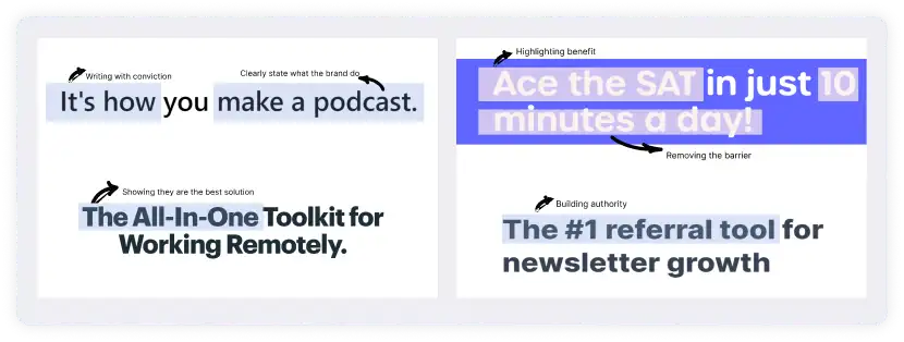
Here are some tips for header optimization:
Write what makes you unique and what you fundamentally offer.
Remove jargon or generic words like comprehensive, best, etc.
No one cares what you do; users care what you can do for them. Focus on the value.
And one final tip - What can you say about your product that no one else in the world can? This question will compel you to pick out your product’s USP and frame it such that it stands out.
The headlines which work best are those which promise the reader a benefit - David Ogilvy
2. Optimize sub-header to show the how
Subheaders help you get more specific about your product or services. You have described the what in the header; use a subheader to explain the how.
Besides that, ensure that your subhead doesn't look like a paragraph. It should be concise, skimmable, and legible.
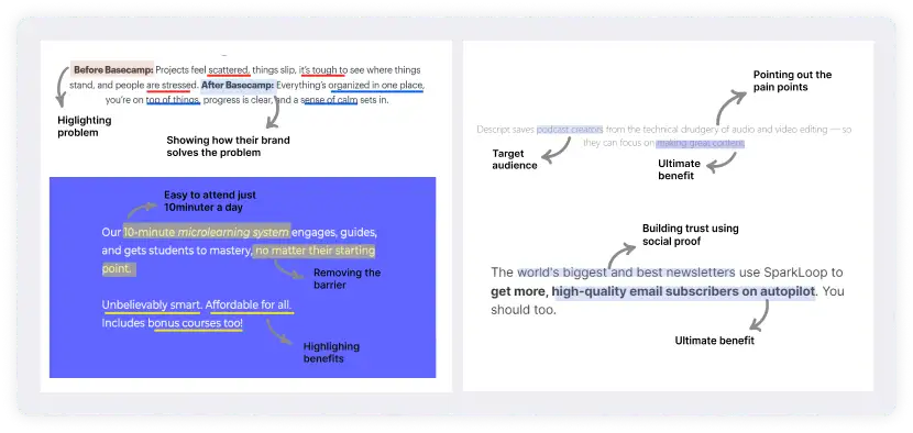
The brands we mentioned above use their subheader effectively.
Basecamp makes a before and after comparison. They target users' pain points and show them how they can benefit and resolve those pain points.
Everydae reflects its USP - ‘microlearning system’ and ends with three powerful benefits - smart, affordable, and bonus courses.
Sparkloop shows its authority and credibility by mentioning that all other brands use it. They make strong convictions in the subheader.
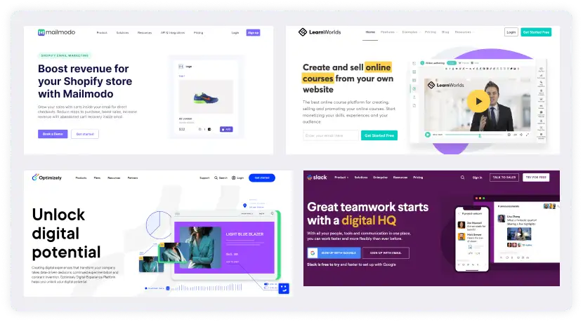
3. Demonstrate your product using imagery
The purpose of having visuals - images or GIFs is to help users visualize your product and reinforce your value propositions. You should avoid putting random and generic stock images as it will generate no value for the users.
Users don't come to your page to see random pages. If they wanted to, they would go to Tumblr or Pinterest. So, show your product images or your product/services in action.
4. Build credibility via social proof
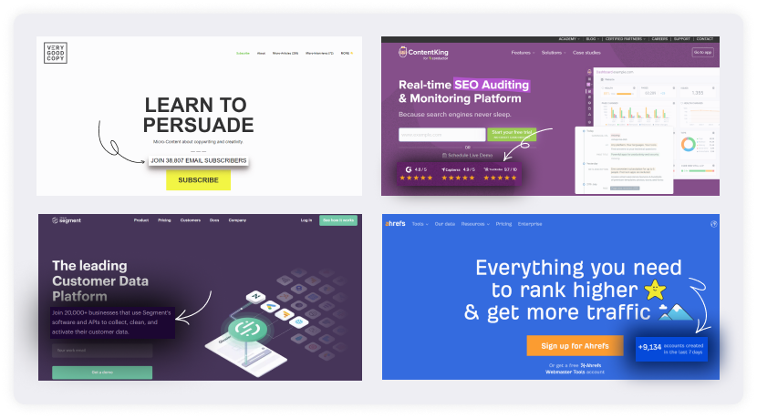
If your landing page doesn't have social proof above the fold, you should consider adding it. Social proof provides instant credibility and backs up what you promise in your heading and subheading.
Here are some brands that use social proof brilliantly above the fold:
5. Entice action with actionable CTA
The call to action button should be optimized and dictate what action they should take next. Here are some tips to optimize your page's CTA:
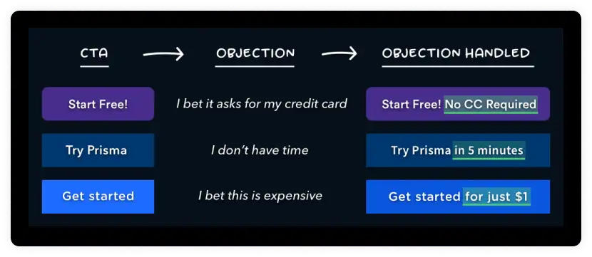
If your copy is generic, like start your free trial, or click here to start, users will gloss over it instead of clicking. So, offer value in your CTA copy that aligns with the title and subhead.
Use objection handling to resolve users' doubts which might be the reason behind low conversions.
Source: Harry marketing example
- Optimize your CTA design by using color contrast and making the button size bigger to make it stand out from the rest of the page's elements.
Below the fold optimization
Users don't usually convert even if above the fold ticks all the right optimization boxes. That's why you should optimize below the fold too. Here are what all you can optimize:
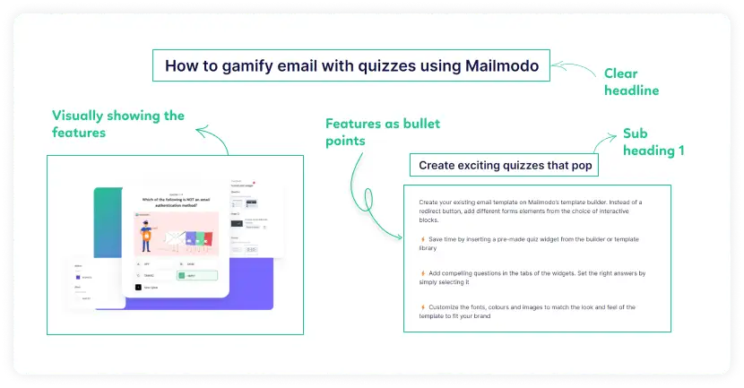
1. Describe features in hierarchical order
The features in the following sections should explain the value proposition you made in the title and sub-head (above the fold). Feature section should be designed in a hierarchical order → Title > Paragraphs > Images.
Here are our tips to optimize each element in your features section:
Optimize the title that reflects your claim, and then highlight the pieces of evidence to support your claim.
Use user-centric language, target their pain point, and instantly resolve their skepticism using your unique brand voice.
Pair each feature section with a compelling and relevant image. If your landing page has only text, it will look like a wall of text pushing away the reader. So, use images.
2. Add social proof to enforce credibility
97% of B2B customers cited testimonials and peer recommendations as to the most reliable type of content in determining whether to buy from a company.
You can inspire action by adding social proof below the fold. If users are bounced after seeing the features, it might be due to a lack of inspiration. Adding a social proof can help you combat this.
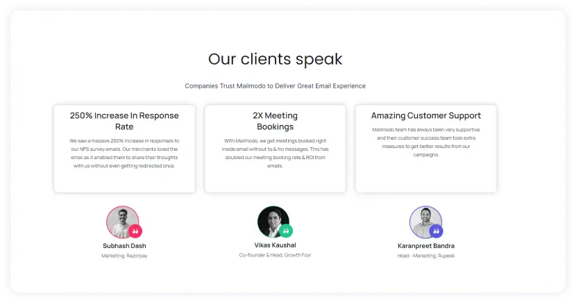
Besides testimonials, try using statistics. As per Demand Curve's insights, It's easier to explain visually the volume of data they're able to handle than it is to explain through a copy.

Image: Customer.io landing page Screenshot
3. Use a call to action to prompt action
Besides the primary CTA, you should add other CTAs below the fold so that users can convert right away instead of scrolling above to take action.
Again, CTAs should be easy to recognize and clearly define what actions users should take.
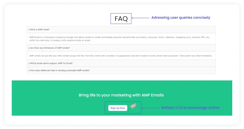
4. Add FAQs to clear doubts of the visitors
You can also optimize your landing page by adding a FAQ section if you want to address questions users might have but didn't get the answer to in your landing page copy. FAQs help resolve users' doubts which might make them more inclined to take action.
You can also test adding a CTA right below the FAQs to see whether you get more conversions that way.
Step 3: A/B test
Testing different versions of your page offer you something to compare against to gauge the performance better. Every element you test is called a variant in A/B testing. Here you need to create two variants - Variant A and Variant B.
There are two types of variants: Micro variant and macro variant
Micro variants are small changes like changing the font size or color, and such changes are likely to have minimal impact.
Macro variants are significant changes like rewriting the landing page copy, and these are changes that will impact your conversions.
Once you have decided which variant you need to test, follow these steps:
Create version A and Version B.
Use a/b test tools like Google Optimize to show visitors the different versions.
Run the test until you have enough reliable data to draw insights.
Once you stop the test, Google Optimize will generate a report showing the performance of your test. If the changes have shown a positive increase, you should consider implementing them in the live version.
Read in detail: A Complete Guide to Perform A/B Testing
Step 4: Review and measure the performance
Here you need to re-assess the changes you made and check whether you have generated better returns. Heatmap and your analytics platform will help you give the information you need. Here are some of the aspect you should monitor:
Amount of traffic you are getting.
Do you see better engagement?
Do you see more conversions?
Which section is getting more clicks?
If your AB test passes, you can make the 'winner' version live. If it doesn't, time to try something new.
Step 5: Refine
And at the end, if there is still room for improvement then the process begins again.
Also read: Your One-Stop Guide to Conversion Rate Optimization in 2022
Landing page optimization examples
Here are some case studies of brands that see results after optimizing their landing page by making one or the other changes we discussed above.
1. Nomad Cooks
It is a London-based business that lets you book professional chefs to cook in your own home. After optimizing their landing page, they saw an increase in all metrics - Time on site, inquiries, and confirmed bookings.
Before optimization:
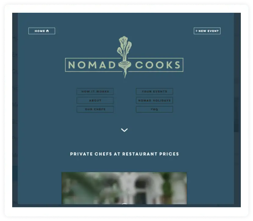
The user was presented with too many choices.
The text had poor legibility.
No social proof above the fold.
The large logo makes it about the company, not a visitor.
The headline was vague and not benefits-focused.
After optimization:
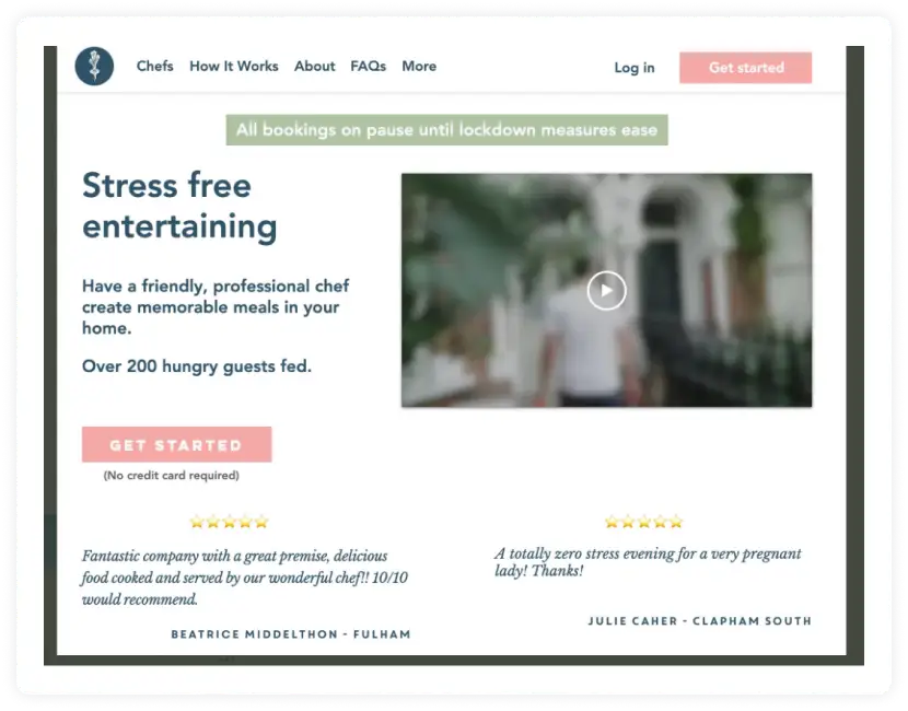
Benefits-based headline.
Obvious, consistent, and clear CTA 'Get Started.'
'No credit card required’ - Reduces friction.
Clear and strong testimonials above the fold.
Video to show and enforce the header text.
Social proof - '200 guests served.'
2. SnackNation
It is a subscription service that brings healthy snacks to your home or office. It used this exit-intent fullscreen popup offered by Optionmonster to help reduce the number of people who left their website:
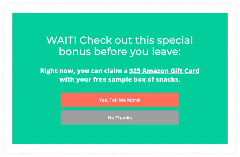
Once they started using this campaign, they could recover and convert 38.5% of abandoning visitors.
This can be a powerful addition to your landing pages to boost conversions.
3. Moon pod
Moon Pod is a company that develops products such as anti-anxiety float chairs, enabling users to reduce stress levels and elevate their relaxation.
Moon Pod wanted to maximize its revenue from paid ads, and with Splitbase, it built and tested many formats, from "Hero-style" pages to "advertorial-style" content-heavy landers.
Some were built specifically for Facebook ads, some for Google ads, and the strategy varied whether incoming traffic came from prospecting or retargeting campaigns.
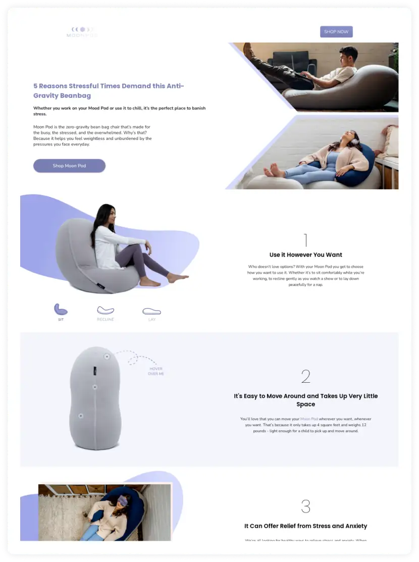
The landing pages built as part of this program successfully became an instrumental part of Moon Pod's customer acquisition strategy by increasing conversion rate and AOV and significantly reducing customer acquisition costs.
Landing page optimization tools
Here is a list of tools that will help you get insights and optimize your landing page for more conversions:
1. For analytics, sessions, and traffic
You need insights into your landing page performance - traffic reports, channels, events, sessions, etc. You can get all this from Google Analytics or your default marketing analytics tool like Amplitude, Hubspot, etc. You need to embed tracking scripts on different elements to track the performance. All these reports will help you analyze your marketing spend and identify areas for improvement.
2. For comparing pages
Use Google Optimize, a free a/b test tool to compare the different versions - version A and version B. It is known as a/b testing, and it is one of the best ways to test the effectiveness of your landing page's design and copy. The tool runs the test for a certain length and returns the 'winner' version.
3. Landing page builder and analytics
Tools such as Unbounce, Instapage, or Optimizely help you create a compelling landing page, track its performance and help you refine the different elements to drive maximum traffic and conversions.
Landing page optimization checklist
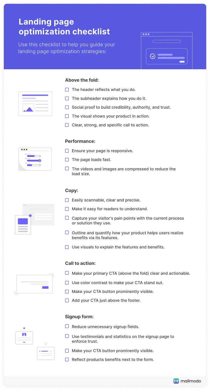
Use this checklist to help you guide your landing page optimization strategies:
Above the fold:
The header reflects what you do.
The subheader explains how you do it.
Social proof to build credibility, authority, and trust.
The visual should show your product in action.
Clear, strong, and specific call to action.
Performance:
Ensure your page is responsive.
The page loads fast.
The videos and images are compressed to reduce the load size.
Copy:
Easily scannable, clear, and precise.
Make it easy for readers to understand.
Capture your visitor's pain points with the current process or solution they use.
Outline and quantify how your product helps users realize benefits via its features.
Use visuals to explain the features and benefits.
Call to action
Make your primary CTA (above the fold) clear and actionable.
Use color contrast to make your CTA stand out.
Make your CTA button prominently visible.
Add your CTA just above the footer.
Signup form
Reduce unnecessary signup fields.
Use testimonials and statistics on the signup page to enforce the trust.
Reflect products benefits next to the form.
Get a Google Doc copy of this checklist
Start optimizing your landing page
Your landing page is a core converting item of your marketing collateral, and it needs to be refined to convert your site's visitors. The more you understand your target audience, the better you can optimize landing pages that satisfy their needs and resolve their pain points.
Read our website audit guide to understand your overall website's performance. We cover different audits you can cover to optimize your site for maximum traffic and conversions.
What you should do next
Hey there, thanks for reading till the end. Here are 3 ways we can help you grow your business:
Talk to an email expert. Need someone to take your email marketing to the next level? Mailmodo’s experts are here for you. Schedule a 30-minute email consultation. Don’t worry, it’s on the house. Book a meet here.
Send emails that bring higher conversions. Mailmodo is an ESP that helps you to create and send app-like interactive emails with forms, carts, calendars, games, and other widgets for higher conversions. Get started for free.
Get smarter with our email resources. Explore all our knowledge base here and learn about email marketing, marketing strategies, best practices, growth hacks, case studies, templates, and more. Access guides here.


