You open an email, but you need to scroll horizontally to get the entire view of an image. So why did you have to do that in the first place? Because the sender didn't care enough to make it responsive to your device's screen.
Don't let it happen to your email marketing campaign. It's time you start making emails responsive if you aren't already.
This guide will discuss the importance of responsive emails and help you understand the technicalities of creating responsive HTML emails.
Table of contents
What is responsive email design?
A responsive email is an email that renders well across all devices - desktop, mobile, and tablet in all email clients.
The email is responsive, using fluid images, fluid tables, and media queries to control and adjust the email layout, images, text size, and CTA buttons and maintain a smooth flow across different devices, OS, and email clients.
Before deep-diving into responsive emails, we will discuss two main factors that influence the responsiveness of an email.
Which factors determine how an email is displayed?
Two factors determine how an email is rendered in a user's inbox. These are - Device's screen size and the user's email client.
1. Device screen size
Email is accessed differently due to people's device usage variations - desktops, PCs, Smartphones, Samsung mini, etc. In addition, these devices vary in size, width, and height, thus affecting how your email will render.
On a desktop, the screen is much bigger, and thus it becomes easy to navigate, scroll, and click on links and buttons.
In contrast, smartphones restrict such accessibility due to their smaller screen size. The content is reduced to fit the screen and thus making everything else - text, images, and links, much smaller and difficult to read, navigate and click.
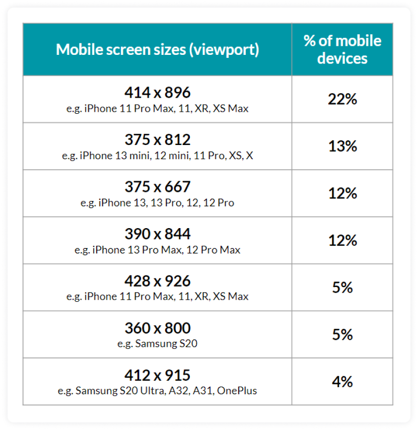
Here is the list of the most common mobile screen size for 2022 by Worship:
2. Email clients
The other big enemies of responsive email are email clients. An email client is a program subscribers use to view and read their emails.
As per Litmus's January 2022 email client share, Apple (57.16%), Gmail (30.17%), and Outlook (4.44%) are the top 3 email clients used by subscribers to view and read emails. Each email client shows email differently; thus, one size-fit approach will not work across these email clients.
Now that you know the factor affecting the responsiveness of your emails let's talk about why you should make emails responsive.
Why should you make your emails responsive?
Responsive email design is not something you can negotiate with. It has become necessary to give users a better reading experience and connect with them. So, here are major reasons for making emails responsive if you haven't already:
• Increasing use of mobile devices
Launching a responsive mobile email design can increase unique mobile clicks by 15%. MailChimp, 2019.
Marketers said desktop opens increased by 11.6% while mobile opens increased by 56.8% in 2021 - State of email 2021 Mailmodo.
47% of emails are opened on mobile devices, yet many are designed only for desktop viewing. - Litmus
So, it is evident that mobile devices are used more than other devices, so making emails that look good and render well on small screens is a must. And if you don't consider that, you will lose many subscribers and thus email ROI.
• Creates a good user experience
Users will access and read your emails without any issues if your emails are responsive. In addition, users can easily navigate and scroll through email content, generating higher engagements.
• Reduce unsubscribe and increase click-through rate
Users will get annoyed if they can scroll to access an image entirely. They would unsubscribe or delete your emails.
As per Constant Contact's data, 75% of subscribers admit they will delete an email if they can't read it on a mobile device. But, designing responsive images, layouts, buttons, etc., will help you overcome this annoyance, increase the click-through rate, and reduce the unsubscribe rate.
• Vital to make emails accessible
Making emails responsive help in ensuring email accessibility for all users, no matter which device, OS, and email client they use.
We have discussed earlier that you can make email responsive using media queries, but support for an email client is not uniform across email clients.
Support for media queries in different email clients
Emails are made responsive using media queries, so if a client doesn't support them, the email won't render as per your expectations.
Let's look at which email client support media queries to give you a heads up:
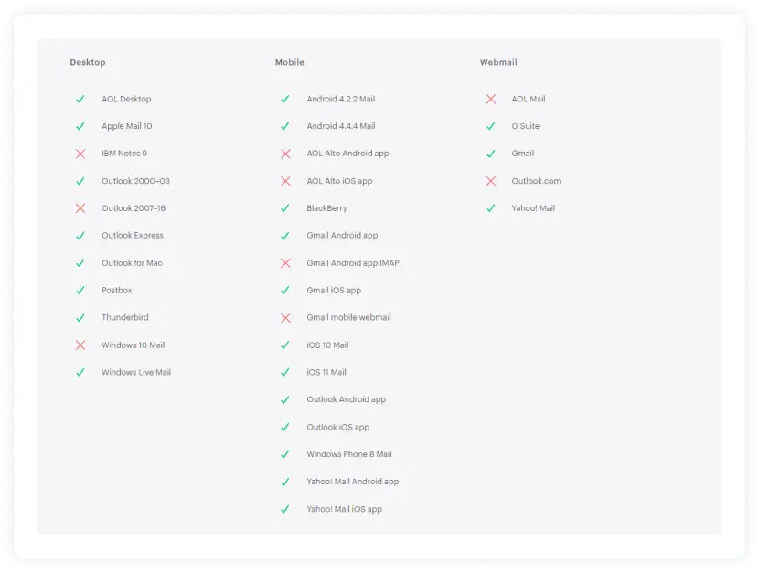
Source: Campaign Monitor
Note: Support for media queries is based on the application/email client used to view the emails and not the device or operating system. It means it's possible to view the same email in two apps on the same device, each with different support for responsive design.
Here is an example of Mailmood's newsletter in Gmail web client and Microsoft Mail App.
Gmail on web 👇

Microsoft mail app 👇
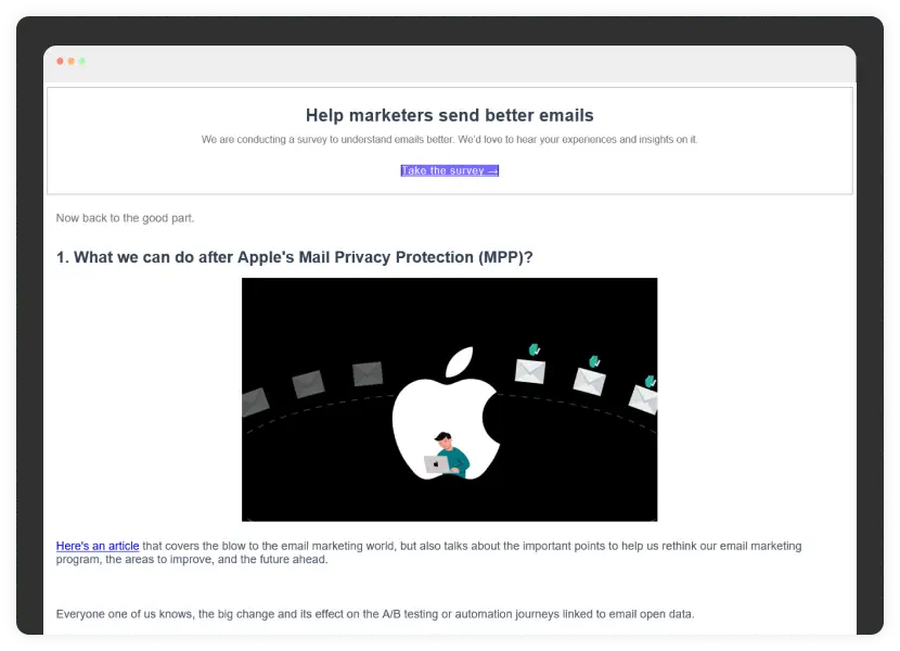
So, you must understand which app/email client supports media queries before you begin making emails responsive. So, let's now talk about the juicy party - Designing responsive emails.
How to make your emails responsive?
Emails are made responsive by adding media queries in the HTML code, also known as @media—a special set of CSS styles that act like conditional statements or dynamic rules. When done right, they can help make emails more readable on different screens.
Media queries detect the screen size and then 'turn on different rules. Depending on what you'd like to accomplish, these can be very simple to implement or quite complex. However, they require more planning and testing than standard emails and don't work with all email clients.
Media queries are nested within the HTML emails <style> tag and looks like this:
@media only screen and (max-width:480px){
}
Media queries open with the @media at-rule.
Next comes the keyword, ‘only’ in this case. It restricts the application of media queries to a specific media type that comes next.
After that, 'media type' is set. Screens and printers are the most common media type used.
Then another keyword, 'and' follows.
Finally comes to the media features, which is the meat of the media query. There are many media features available, but the most commonly used is Max-width: measured against the available space of a browser or device.
In the above code, the max-width is 480px. It means a screen of 480px or smaller size will trigger the CSS code embedded within the @media attribute.
Now, you might arise as to why you choose 480px. It's because 480px is the standard width of a mobile phone's screen in landscape orientation and a good standard breakpoint to use in your code.
Now, we will discuss how to make different email elements responsive:
• Increase text size for better legibility
You can use media queries to increase text when an email is viewed on mobile or smaller screen sizes to give users a better reading experience.
For desktop, 14px text size is fine, but when viewed on a smaller screen, it can make readers squint their eyes to read such small text. That's why using 16px is recommended for mobile users.
To do that, you can use the following code:
<style type="text/css">
@media only screen and (max-width: 480px){
.bodyContent{font-size:16px !important;}
}
</style>
When the media query is triggered on a screen of width 480px or less, the text size will automatically increase up to a readable size, as shown in the image below:
• Make images adaptable to screen size
Having all the images adaptable to the device or screen size is important as an image wider than the standard 480px size would result in horizontal scrolling. To avoid this, you should make your images fluid to become adaptable to different media query trigger sizes. Here is a code to make images fluid and adaptable:
<style type="text/css">
@media only screen and (max-width: 480px){
.emailImage{
height:auto !important;
max-width:600px !important;
width: 100% !important;
}
}
</style>
To avoid overriding an image on the screen of 480px or smaller, specify a max-width for the image, so it doesn't look blown out of proportion.
As a standard, the max-width should be the same as the image's original width. So once the media query is triggered, the user sees an image that fits on a small display, just as in the image below:
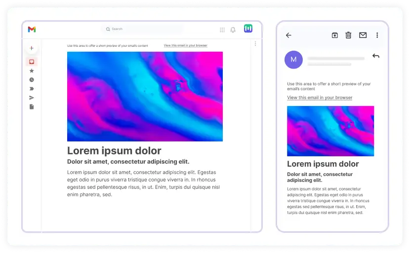
The image is fluid, filling its available space regardless of whether the screen orientation is portrait or landscape.
• Make CTA buttons responsive
Buttons are usually the email CTA; making them clickable and easy to recognize, especially on smaller screens, can benefit you and the reader.
For example, here's a standard HTML button and how it appears when an email is viewed on a desktop:
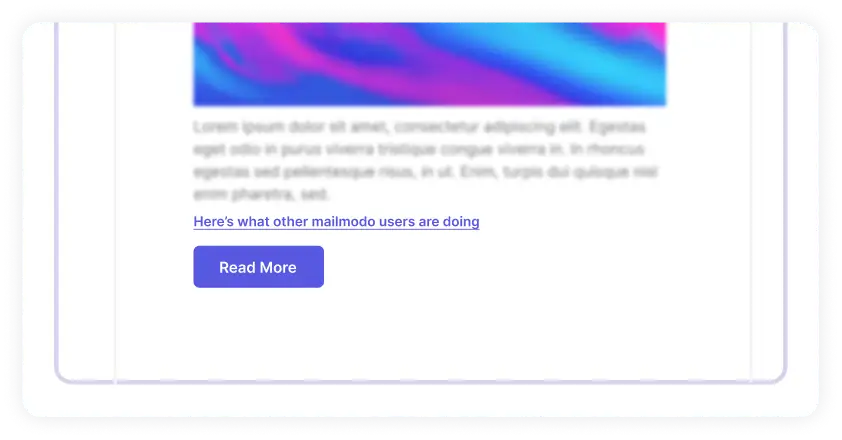
For smaller screens, change the button's width, increase the text size and change the link to a block-level element:
<style type="text/css">
@media only screen and (max-width: 480px){
.emailButton{
max-width:600px !important;
width:100% !important;
}
.emailButton a{
display:block !important;
font-size:18px !important;
}
}
</style>
The code above will result in a more clickable and readable button:

• Converting links into clickable buttons
There are places where many links are placed together.
For example, most email footers contain many links such as unsubscribe links, privacy policies, manage email preferences, etc.
When viewed on a desktop, these links don't appear as clusters and can be easily clicked, as shown in the image below. But it isn't easy to click on the desired link when viewed on mobile.
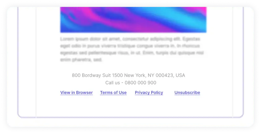
A reader may struggle to tap only one link at a time. So, there is a usability issue. But, you can provide a solution to this with a media query:
<style type="text/css">
@media only screen and (max-width: 480px){
#utilityLink{
max-width:600px !important;
width:100% !important;
}
.utilityLinkContent{
background-color:#E1E1E1 !important;
border-bottom:10px solid #FFFFFF;
display:block !important;
font-size:15px !important;
padding:15px 0 !important;
text-align:center !important;
width:100% !important;
}
.utilityLinkContent a{
color:#606060 !important;
display:block !important;
text-decoration:none !important;
}
}
</style>
Add border-bottom to each `
Add border-bottom to each <td> and match the color to the email background. As a result, link buttons will become distinguishable from other email elements. The result will look like this:
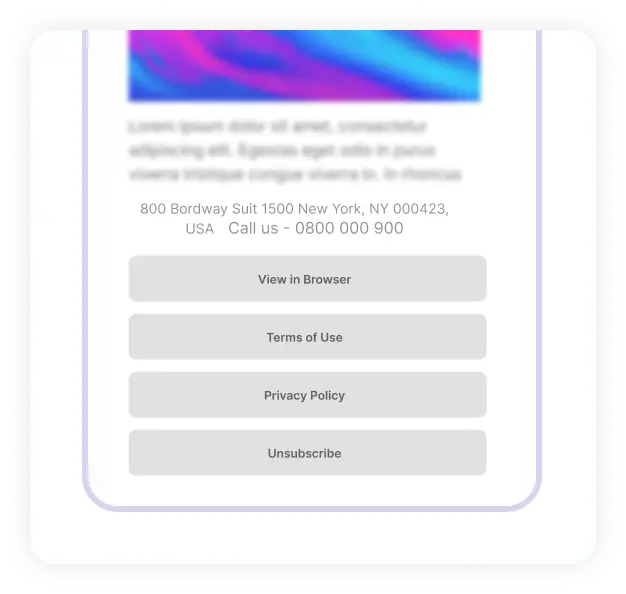
Each link is now easy to recognize, and users can easily tap with a finger, and everyone's happy.
Responsive HTML emails best practices
Follow these best practices to create responsive HTML email campaigns to enhance user experience:
• Keep your email subject line within the character limit
Validity suggests the following character limit:
For desktop - about 60 characters.
For mobile devices, show just 25-30 characters.
• Prioritize single-column layout
Use a single-column layout as it is easily legible on mobiles, and the content seems more readable and less cluttered when viewed on smaller screens.
• Make CTA buttons large enough
As per Apple's guidelines, keep your CTA buttons as 44 x 44px to provide ample room for adaptation. At the same time, Google recommends 48 x 48 px for CTA buttons.
• Don't put too many links together
Avoid clustering several links in your email copy. It makes individual links very difficult to click, especially on smaller screen devices. It can ruin the user experience causing friction in the conversion process.
• Prioritize content to display first
You can prioritize which content you want to display on a smaller screen first for the best viewing experience. Besides, you can also hide content on a smaller screen if it's not that necessary.
• Preview and test your email on your seed list
Always preview and test your emails to ensure they render as planned. For this, use a seed list and send emails to addresses in that list. It is more helpful if you have email addresses that use different email clients. It will help assess the rendering across various clients.
Responsive email templates
You don't have to go through the hassle of creating responsive HTML emails from scratch. Many email marketing tools offer a drag-and-drop editor to create your template or choose from their email template gallery.
1. Mailmodo
What if responsive design is combined with interactivity that offers users to perform a task within their email?
Sounds cool, right? That's exactly what Mailmodo offers you.
A collection of responsive and interactive AMP and HTML responsive emails to amaze your audience and generate higher engagement on your next email campaign. Using our no-code email template builder you can create responsive emails and preview them before sending them to your subscribers.
2. Dyspatch
Looking for open-source email templates? Dyspatch is here to help. It offers numerous HTML email templates across different categories with a free Dyspatch or Sendwithus Account.
3. Campaign Monitor
Choose from Campaign monitor's library of mobile-friendly responsive email templates or build your own using their drag-and-drop email builder. There are templates for different categories, such as newsletters, feedback emails, and holiday emails.
4. Mailchimp
Mailchimp offers a responsive templates gallery to send to your subscribers to create brand awareness and engage with your subscribers. However, you must sign up and create your account to access their template.
5. Stripo
Stripo has an extensive collection of 900+ free HTML email templates that are responsive and customizable per your requirement. You get access to responsive templates based on content type, season, industry, and features. In addition, you can expose three templates to 60+ ESPs, including Mailchimp, Hubspot, AWeber, and so on.
🔍 Compare: Mailmodo vs Stripo
6. Unlayer
Unlayer is among the best drag-and-drop template builders offering free and paid email templates. All templates are responsive, and you need no coding skills to build an engaging and great email template to hook your subscribers.
7. Litmus
Litmus offers free responsive email templates designed by the best email designers across different industries. In addition, you can access several categorical email templates and customize them to fit your needs.
Wrap up
The email landscape is continually changing, and as an email marketer, you must ensure that your campaigns are adaptable to these changes.
Keep your audience at the core of your marketing strategy and create emails that are responsive and accessible to all of them.
It will help you build long-term loyalty and trust with your audience and enhance your business performance.
What you should do next
Hey there, thanks for reading till the end. Here are 3 ways we can help you grow your business:
Talk to an email expert. Need someone to take your email marketing to the next level? Mailmodo’s experts are here for you. Schedule a 30-minute email consultation. Don’t worry, it’s on the house. Book a meet here.
Send emails that bring higher conversions. Mailmodo is an ESP that helps you to create and send app-like interactive emails with forms, carts, calendars, games, and other widgets for higher conversions. Get started for free.
Get smarter with our email resources. Explore all our knowledge here and learn about email marketing, strategies, best practices, growth hacks, case studies, templates, and more. Access guides here.


